5 Common Sign Color Mistakes That Make Yours Invisible
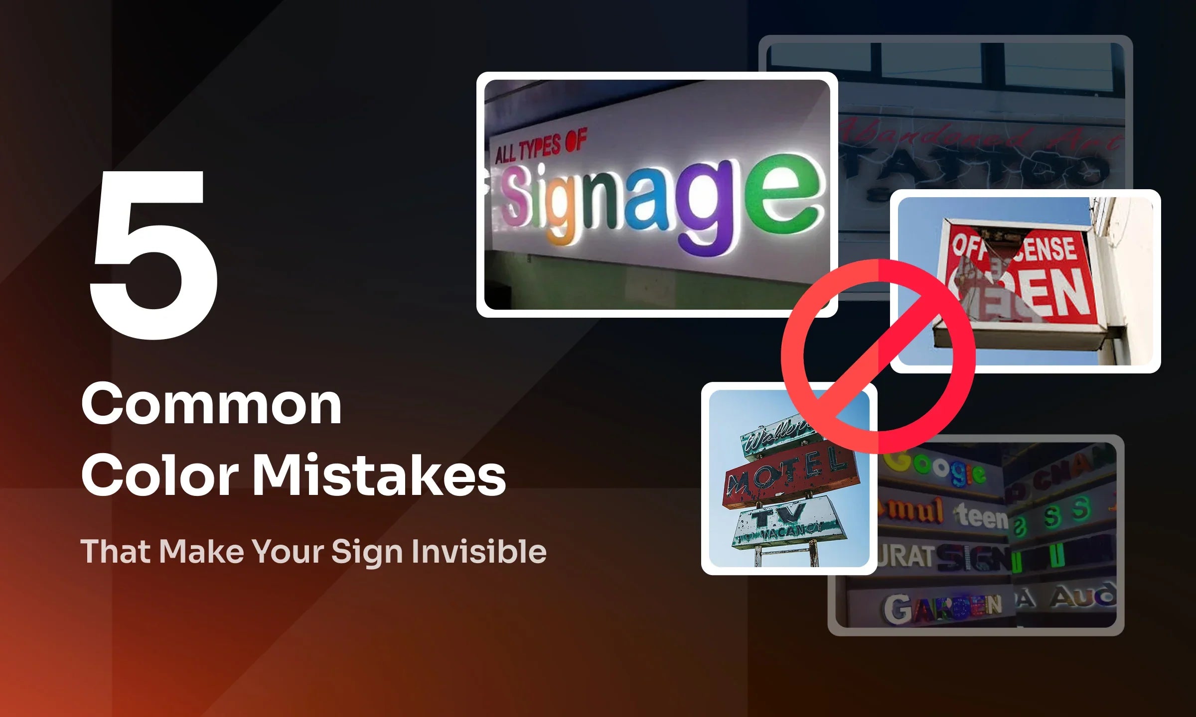
Color is one of the most critical factors in effective signage. It influences how well a sign is seen, understood, and remembered. Poor color choices can render a sign ineffective, reducing brand visibility and customer engagement.
Many businesses unintentionally make sign color mistakes that affect readability, contrast, and psychological impact. These mistakes lead to lost marketing opportunities, as signs fail to attract attention or convey the intended message. In this article, we will highlight five common color mistakes and how to correct them to ensure your sign stands out.
1. Low-Contrast Sign Colors That Reduce Readability
Low-contrast sign colors make text difficult to read from a distance or under certain lighting conditions. For example, gray text on a white background or dark blue on black lacks contrast, causing the text to blend into the background. This issue is especially significant for outdoor signs, where natural lighting conditions constantly change. Signs that are ineffective in low-light environments or from a distance can lead to poor readability, ultimately reducing customer engagement. Additionally, low contrast may cause viewers to overlook or ignore the sign entirely.
How to Fix It:
✔ Use high-contrast color combinations, such as:
-
Black on yellow (road signs, safety signs)
-
Blue on white (healthcare, corporate signs)
✔ Test your color scheme using grayscale filters or contrast checkers.
✔ Avoid using light text on a light background or dark text on a dark background.
2. Using Too Many Sign Colors That Distract From The Message
While vibrant colors help a sign stand out, overusing too many colors creates visual clutter and overwhelms viewers, making it difficult to focus on the key message. Excessive colors can dilute the visual hierarchy of the sign, preventing target customers from identifying the most important information.
How to Fix It:
✔ Limit your design to a 2-3 color palette for clarity and consistency.
✔ Use colors strategically by selecting one dominant color and one or two accent colors.
✔ Follow brand guidelines to ensure consistency and maintain a professional look.
3. Selecting Sign Colors That Fade Too Quickly in Outdoor Signage
Fading is a common issue for outdoor signage due to prolonged exposure to environmental factors, particularly ultraviolet (UV) rays from direct sunlight. UV rays break down the chemical bonds in pigments, leading to a loss of color intensity over time. Additionally, extreme temperatures accelerate the fading process, especially with colors like orange, red, and yellow. Rain and snow further contribute to color degradation by weakening sign materials and paint. Faded signs appear outdated and neglected, increasing long-term replacement costs.
How to Fix It:
✔ Apply UV-resistant coatings or protective paint to block UV rays and prevent fading.
✔ Choose materials with inherent UV resistance, such as UV-stable engraving materials or durable sticker materials like vinyl or polyester.
✔ Use high-saturation colors or darker shades that withstand prolonged sun exposure.
✔ Position signs in shaded areas or orient them north or south to minimize direct sunlight exposure.

4. Ignoring Backgrounds and Surroundings When Choosing Sign Colors
A sign may look great in design software, but in real-world settings, it might blend into the background or lose visibility due to lighting conditions. For example, a red sign against a red brick wall may fail to stand out, reducing its intended impact. Poor contrast between the sign and its surroundings can significantly affect readability and visibility.
How to Fix It:
✔ Test and analyze different installation environments to see how colors interact with their surroundings.
✔ Consider contrast under different lighting conditions and use backlit or reflective materials to enhance visibility in low-light areas.
✔ Ensure the sign complies with accessibility standards for readability by all individuals, including those with visual impairments.

5. Choosing Sign Colors That Send the Wrong Message
Every color carries a psychological meaning, influencing how people perceive a brand. Selecting the wrong color can miscommunicate your brand’s message, especially if it conflicts with the company’s identity and personality. This inconsistency can make a business appear unprofessional or confusing to potential customers.
How to Fix It:
✔ Define your brand personality with precision to ensure color consistency.
✔ Test your color palette before making a final decision. Create mockups of your signs with different color combinations and gather feedback from potential customers.
Every element in signage design, no matter how small, plays a crucial role in business success. At AFCultures, we believe that precision, craftsmanship, and dedication drive the creation of signage that stands out and delivers real impact. That’s why we focus on providing cost-effective, high-quality solutions to help businesses gain a competitive edge.
Conclusion
Rather than simply following customer requirements for design and craftsmanship, AFCultures takes a collaborative approach. Every project begins with in-depth discussions and consultations to ensure businesses find the most effective signage solutions tailored to their needs.
For AFCultures, quality and aesthetics are just the starting points. Our signs are carefully crafted to complement their surroundings while maintaining consistency with brand identity. More than just a visual element, signage serves as a powerful marketing tool that enhances brand recognition and customer engagement.
Need Expert Guidance on Signage Selection and Customization?
AFCultures is here to help! Send an email to ✉ [email protected], or book a consultation at a time that suits you by clicking the button below.