News
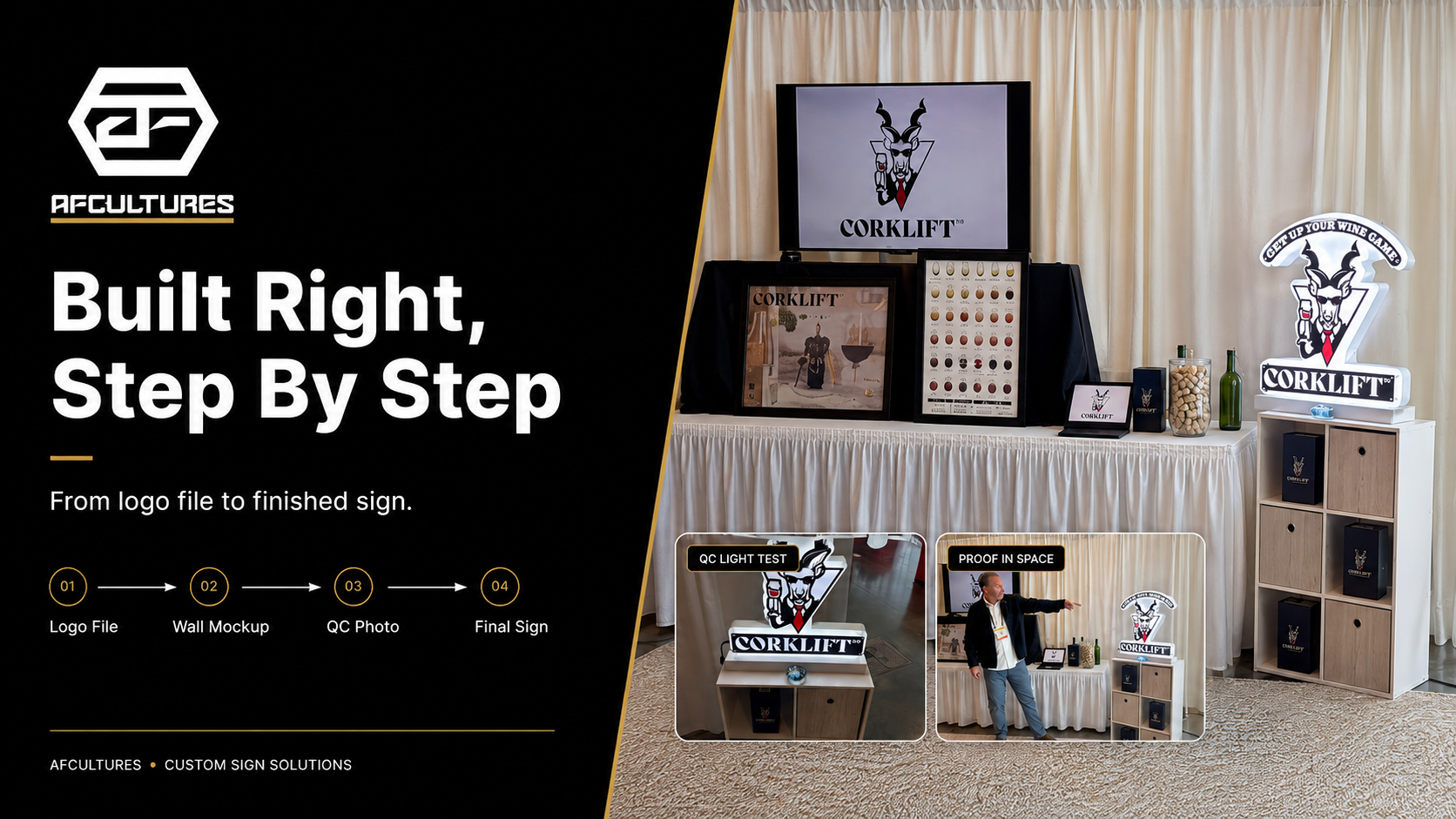
How To Know Your Custom Sign Is Being Built Right
A custom sign should not disappear after the quote is approved. Here is what business owners should expect to see before, during, and after production.
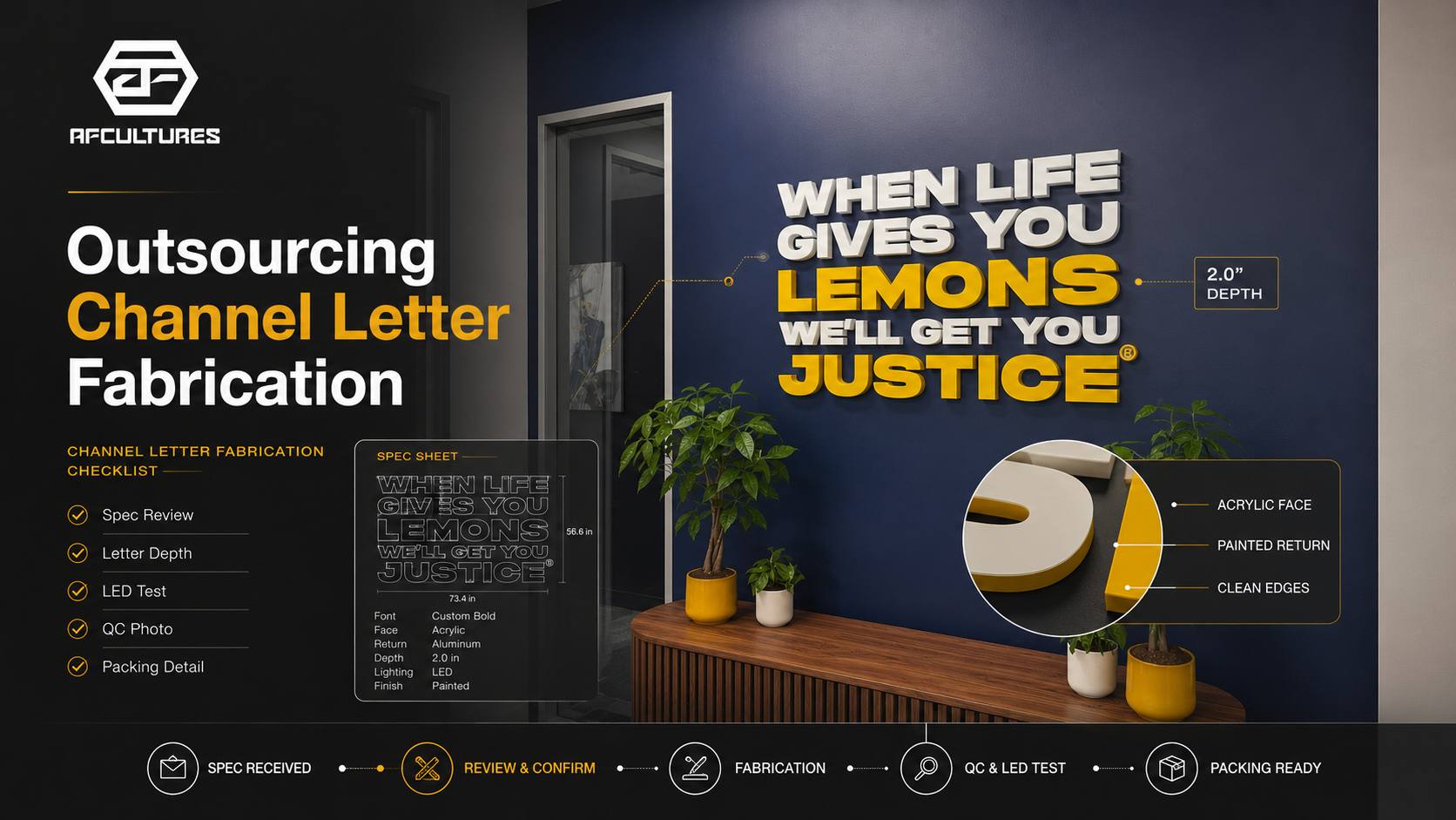
What Sign Shops Should Check Before Outsourcing Channel Letter Fabrication
Outsourcing channel letter fabrication is not only about price. Sign shops should check specs, lighting, UL/NEC considerations, QC, packing, communication, and lead time before sending a project to production.
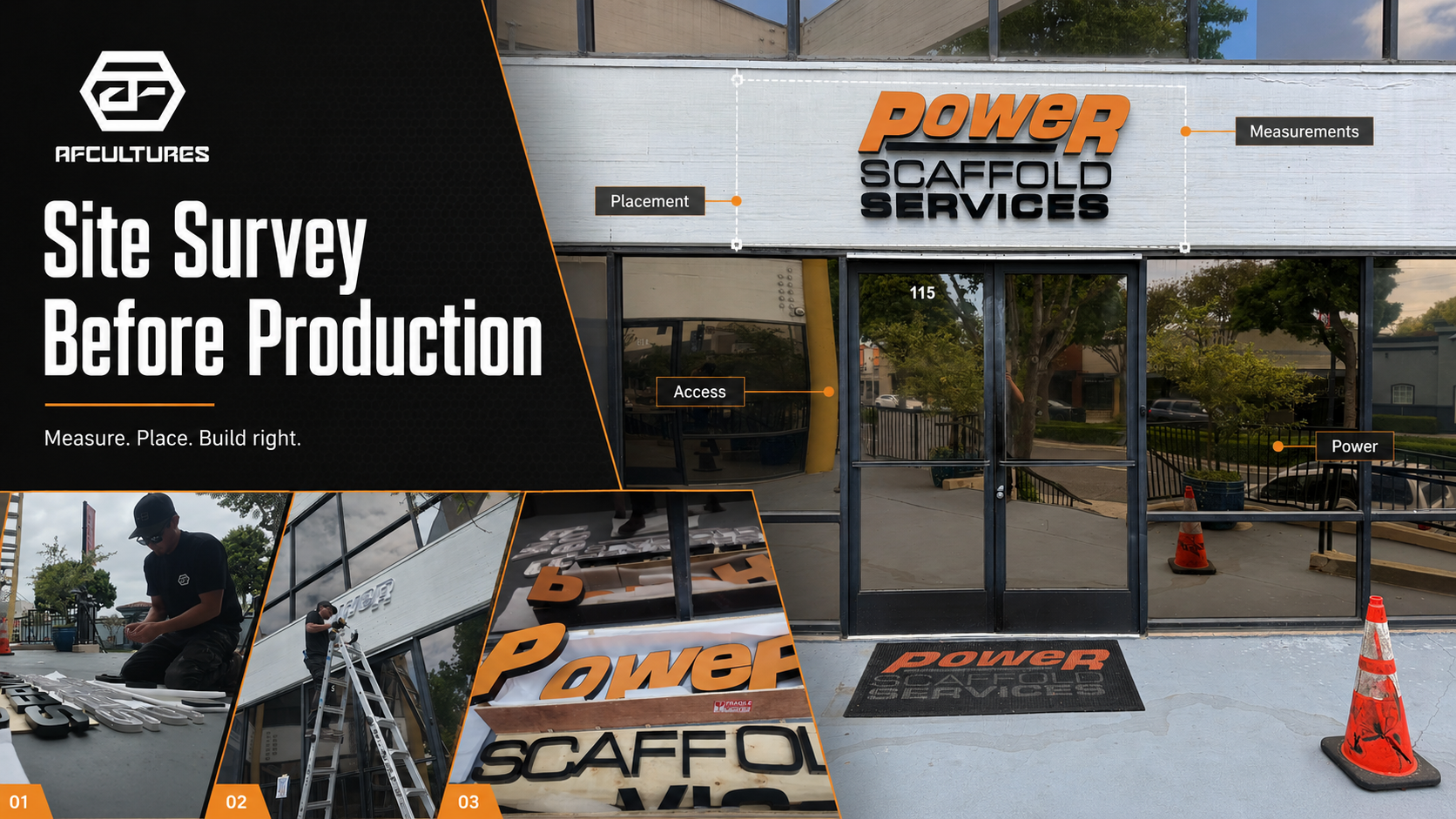
Why A Site Survey Matters Before Sign Production
A site survey helps confirm the real wall, viewing distance, mounting surface, power access, and approval path before a custom sign goes into production.
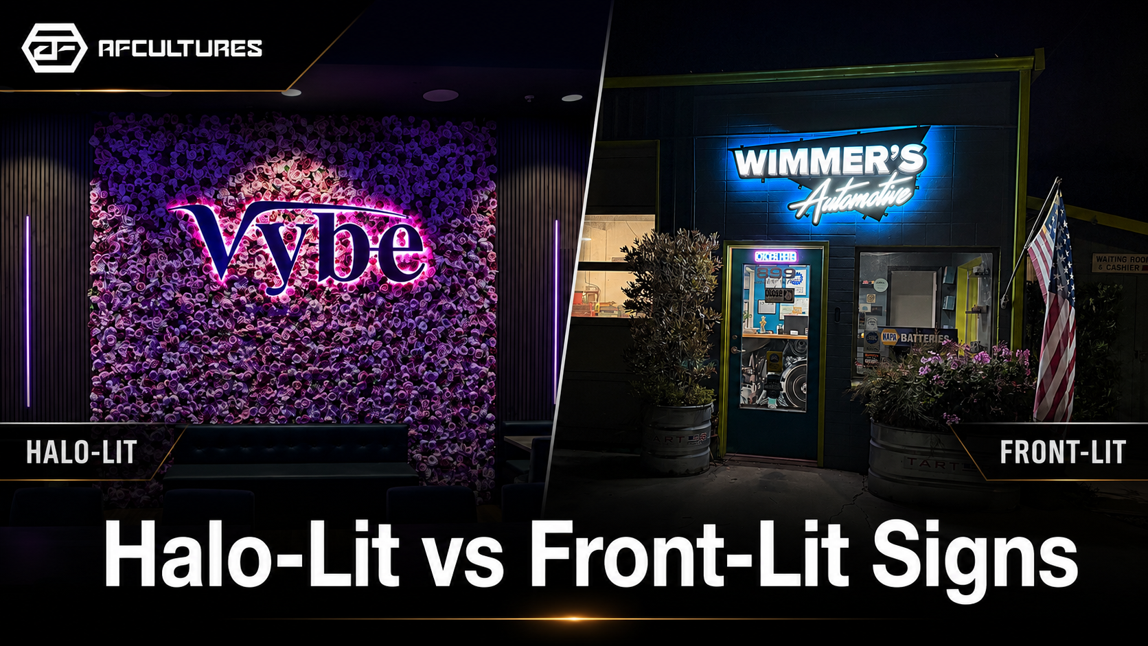
Halo-Lit vs Front-Lit Signs: Which Lighting Style Fits Your Business?
Halo-lit signs create a softer glow behind the letters, while front-lit signs create brighter direct visibility. Learn which lighting style fits your storefront, brand, and space.
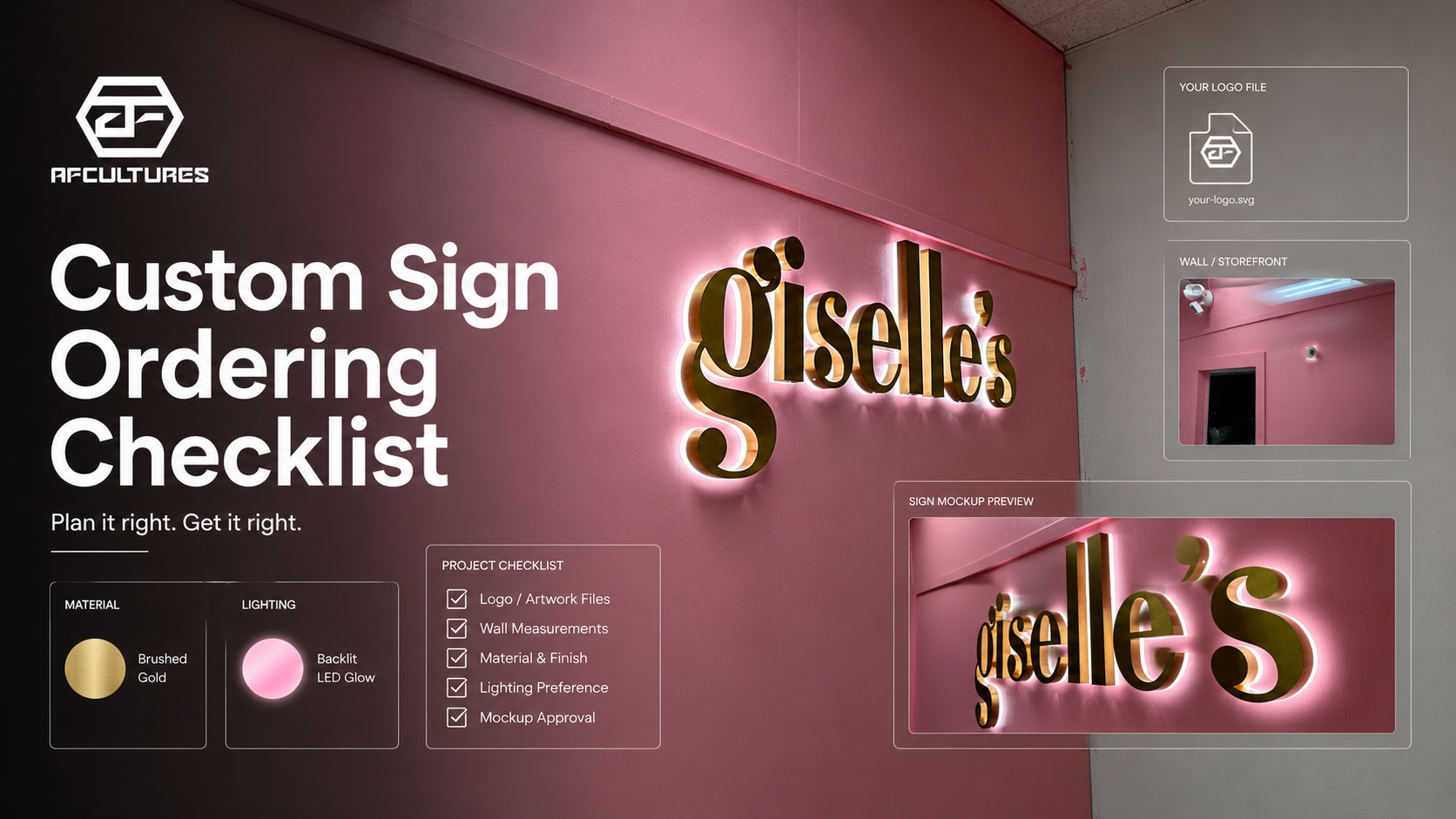
What To Prepare Before Ordering A Custom Sign: A Simple Buyer Checklist
Ordering a custom sign is easier when the right details are ready first. Use this checklist to prepare your logo, wall photo, size, lighting, location, and timeline before requesting a quote.
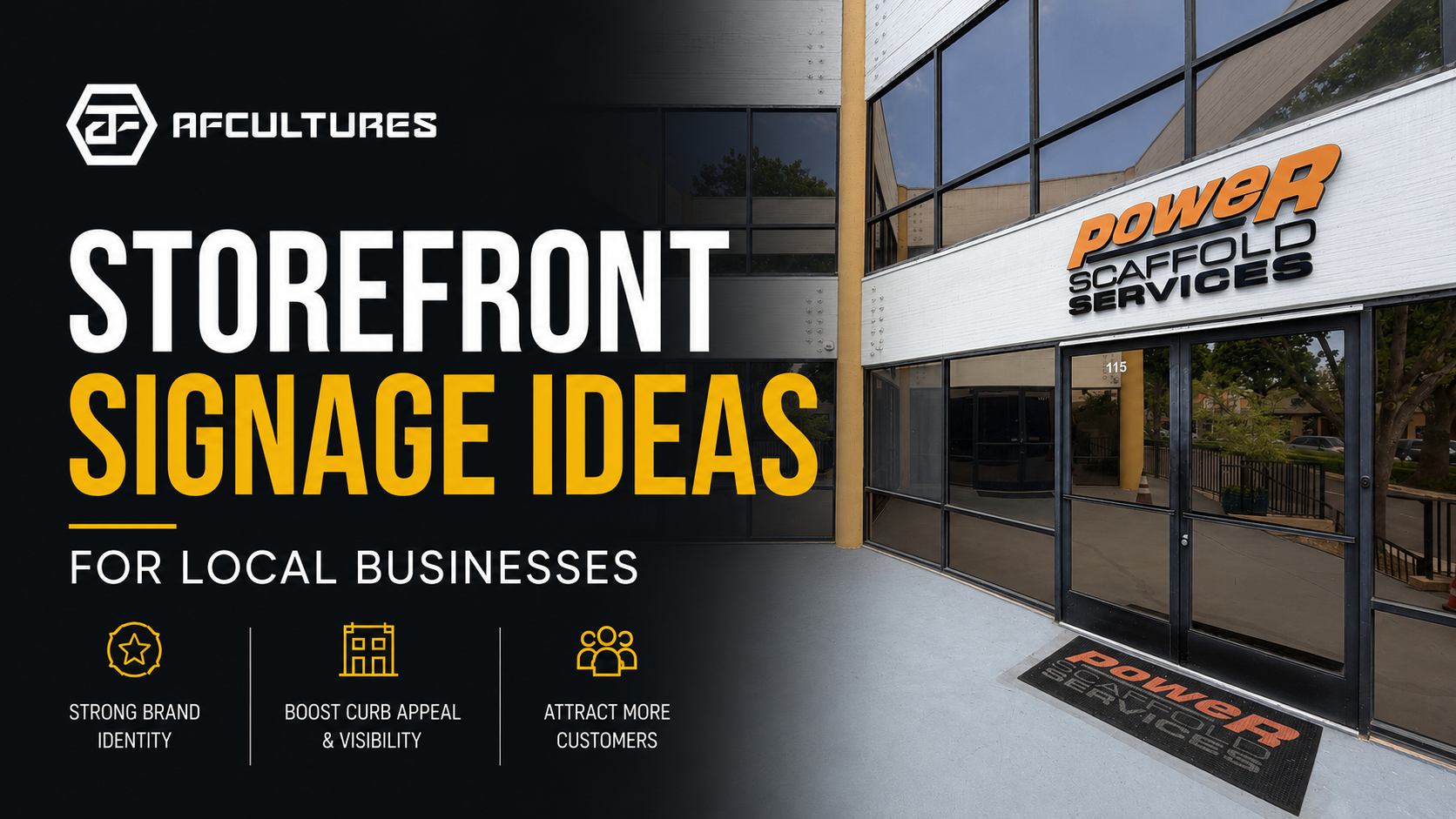
Storefront Signage Ideas For Local Businesses: Make Your Location Easier To Notice
A good storefront sign does more than display your logo. It helps customers notice your business, understand your space, and feel confident walking in.


Get the latest from AFCultures
Join our list for expert tips, design insights & special deals.