

Corporate Office Signage Project Breakdown: Why One Strong Brand Anchor Can Be Enough
WHO SHOULD READ THIS
Corporate office leaders, workplace teams, facility managers, and growing B2B companies planning a new office, headquarters, reception area, or workplace brand refresh.
Quick Answer
A corporate office does not need the company logo on every available wall. It needs at least one brand moment strong enough to establish whose space this is.
For many workplaces, the better planning sequence is: ARRIVE → RECOGNIZE → ANCHOR → SUPPORT
The primary sign should create a clear visual anchor.
Other walls, rooms, and workplace touchpoints can support the identity without competing with it.
The goal is not maximum logo coverage.
It is a workplace that feels deliberately connected to the brand.
Project Snapshot: Kiewit Corporation
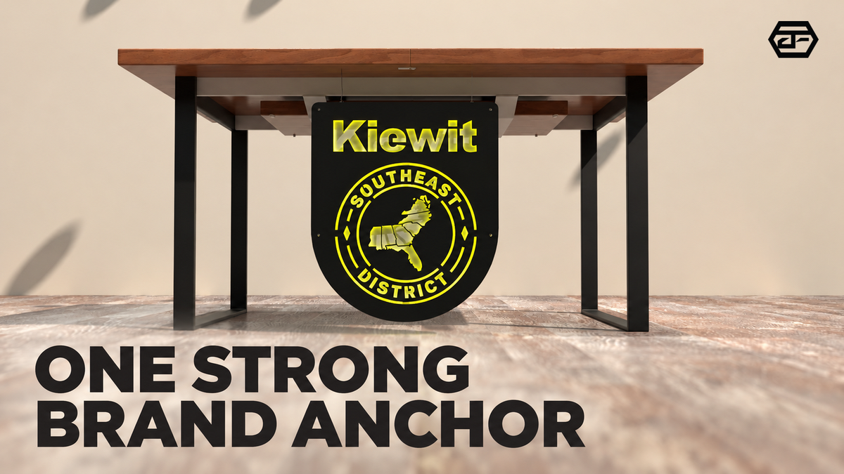
AFCULTURES completed an indoor signage project for Kiewit Corporation, a large construction and engineering organization operating across North America.
The project centered on a corporate workspace where the sign needed to create a visible brand presence for two audiences:
- Employees who experience the workplace repeatedly
- Visitors encountering the company in a physical environment
Rather than treating the sign as decoration added to an empty wall, the project shows a more useful question for corporate offices:
Where should the brand become unmistakable?
1. ARRIVE: Start With What People See When They Enter
A corporate office has several possible places to display its identity.
There may be an entrance, lobby, reception desk, waiting area, corridor, conference rooms, and multiple interior walls.
But they do not all have the same job.
Start from the visitor's actual arrival point.
Ask:
- What is visible when someone first enters?
- Where do visitors naturally stop?
- Which wall sits within their main line of sight?
- Where does the company need the strongest moment of recognition?
A wall may be physically large without being strategically important.
A smaller reception or arrival wall can matter more if nearly every employee, client, candidate, or partner experiences it.
Not sure which office wall should carry the primary brand moment?
Send AFCULTURES your logo, one arrival view, and a wide photo of the proposed wall. We can help review what employees and visitors will actually see before you choose the sign direction.

A primary office sign matters most when it sits within an important arrival or visitor-facing moment
2. RECOGNIZE: Give the Main Sign One Clear Job
The primary office sign does not need to explain the entire company.
Its first job is usually simpler:
Establish the brand clearly in the physical space.
That matters because a corporate environment communicates differently from a website, presentation, or digital campaign.
People experience the office at architectural scale.
The logo now sits beside walls, furniture, lighting, circulation paths, doors, and people.
That surrounding context affects how strong or weak the brand moment feels.
This is why the sign should be evaluated in the real environment rather than only as an isolated artwork file.
Before final approval, it also helps to review what should actually be finalized before a sign moves forward.
3. ANCHOR: One Strong Moment Can Do More Than Several Weak Ones
A corporate office can quickly become visually crowded if every open wall becomes another branding opportunity.
Instead, establish hierarchy.
The primary brand anchor should carry the strongest identity.
Secondary areas can then become quieter.
For example, an office may have:
- One primary reception or entrance identity
- Supporting identification elsewhere
- Room or department signs with more functional roles
- Environmental graphics only where they add meaning
These elements do not need identical visual weight.
They need to feel intentional together.
That principle is also why not every business sign needs to look exactly the same.
A strong workplace identity often comes from knowing which element should lead—and allowing everything else to support it.

A strong brand anchor can establish the identity of the workplace without requiring the same visual statement on every wall
4. SUPPORT: Let the Architecture Stay Part of the Brand Experience
Branding a workplace does not mean covering the architecture.
The office itself already has a visual language.
Materials, wall proportions, furniture, lighting, open space, and movement all influence how the brand is perceived.
The signage should work with that environment rather than behave like a separate layer placed on top of it.
Corporate branded-environment projects documented by the Society for Experiential Graphic Design similarly show workplace identity being integrated with architectural and interior elements instead of relying on repeated logo placement alone.
That is an important lesson from the Kiewit project as well.
The value of a primary office sign is not simply that the logo appears indoors.
It is that the brand gains a clear physical presence inside the workplace.
Planning a new office or workplace brand refresh?
Send AFCULTURES your logo, entrance view, reception area, and the walls you are considering. We can help review which location should lead and which areas should stay supporting.
What Can Other Corporate Offices Learn From This Project?
The Kiewit project points to a simple planning principle:
Start with importance, not available wall space.
Before adding signs throughout an office, identify the moments that matter most.
A useful hierarchy might be: PRIMARY BRAND MOMENT → SUPPORTING IDENTITY → FUNCTIONAL INFORMATION
The first establishes the company.
The second reinforces it.
The third helps the workplace function.
Once those roles are clear, it becomes easier to decide where signage belongs—and where another logo may add very little.
A 5-Question Corporate Office Signage Check
Before choosing individual signs, ask:
- What do employees and visitors see first?
- Which location should carry the strongest brand presence?
- Which other areas actually need supporting identity?
- Which signs are functional rather than brand anchors?
- Does the signage work with the office, or compete with it?
If every wall appears equally important, the hierarchy probably has not been defined yet.
Frequently Asked Questions
Where should a corporate office place its main logo sign?
The strongest location is usually one that combines visibility with importance in the visitor or employee experience. That may be reception, the entrance, a waiting area, or another primary arrival point depending on the office layout.
Does a large corporate office need multiple logo signs?
Not necessarily. A large workplace may need several signage touchpoints, but they do not all need to carry the same logo treatment or visual weight. One primary anchor can lead while other signs support identification, navigation, or information.
What should a company send before planning an office sign?
Start with the logo or brand files, a wide arrival photo, the proposed wall, surrounding office views, approximate available space, and any areas being considered for additional signage.
Give the Brand a Place to Land
A corporate identity may already be strong on a website, presentation, vehicle, or marketing campaign.
The office creates a different opportunity.
It gives that identity a physical place to exist.
Choose the primary moment carefully. Let it anchor the space. Then allow the rest of the workplace to support it.
Planning signage for a corporate office, headquarters, or growing B2B workspace?
Send AFCULTURES your logo, office photos, primary arrival view, proposed sign locations, and project timeline. We can help turn the workplace into a clear signage plan before individual pieces move forward.