


Should Every Sign in Your Space Look the Same?
WHO SHOULD READ THIS
Business owners planning more than one sign across a storefront, office, clinic, gym, showroom, or other customer-facing space.
Quick Answer
No. Signs in the same space should feel related, but they do not need to look identical.
A main identity sign, an entrance sign, a slogan wall, and a directional sign do different jobs. They should share the same brand language, but they do not need the same layout, scale, or level of emphasis.
The goal is simple: Keep the brand recognizable. Let each sign do its own job.
What Should Stay the Same, and What Can Change?
| Keep Consistent | Can Change |
|---|---|
| Brand identity | Scale |
| Core colors | Amount of text |
| Typography style | Logo prominence |
| Overall tone | Placement |
| Visual language | Level of emphasis |
This is the difference between a sign system and a repeated design.
The signs should feel like they belong to the same business, even when they are doing different things.
If color is carrying a lot of that consistency, it helps to review common sign color mistakes before repeating the same palette everywhere.
Different Signs Need Different Levels of Attention
Not every sign should speak at the same volume.
A primary identity sign usually needs the strongest presence.
A supporting wall statement, entrance marker, or informational sign often needs less.
If every sign is equally bold, the space starts competing with itself.
A better question is: What should customers notice first here?
That answer should shape the sign’s visual weight.

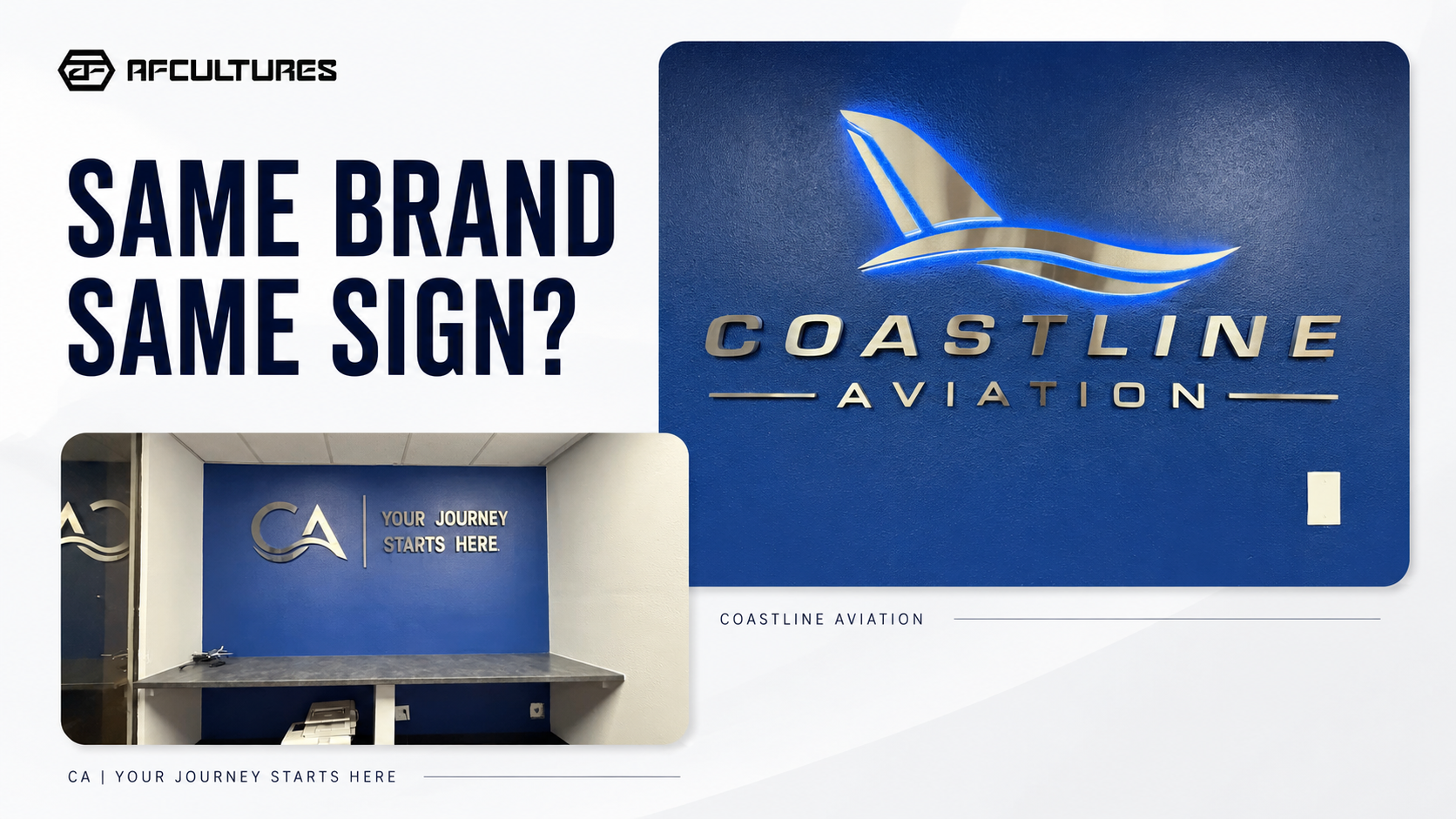
The primary identity sign carries the strongest brand presence because its job is to anchor the business in the space
The Same Brand Can Appear in Different Ways
A good sign system does not repeat the same design on every wall.
It uses the same brand language in ways that match the role of each sign.
For example, one sign may work as the main identity moment.
Another may support the experience with a phrase, tagline, or secondary message.
They still feel connected because they share the same brand cues.
That is exactly what makes the system feel intentional rather than repetitive.
Professional wayfinding and branded-environment systems often work this way too: one visual language, different levels of hierarchy across different touchpoints. If you want an outside example, SEGD case studies show how sign families stay consistent without making every element identical. See an example from SEGD.
The Coastline Aviation Example
These two Coastline Aviation walls are a strong example of the same idea.
One wall works as the primary identity sign:
- brand name
- logo
- stronger focal presence
The other works as a supporting branded moment:
- abbreviated mark
- message-led treatment
- simpler communication role
They do not look identical.
But they still feel clearly part of the same brand because the color, finish, typography style, and visual tone remain connected.
That is the goal.

A supporting branded wall can use the same visual language while taking on a quieter, message-led role
A Simple Check Before You Approve Multiple Signs
Before approving several signs in one space, ask:
1. Do these signs clearly belong to the same business?
If not, the shared brand cues may be too weak.
2. Can I tell which sign matters most?
If not, the hierarchy may be too flat.
3. Does every sign need this much branding?
If not, simplify the supporting pieces.
A good sign family should feel connected without making every surface carry the same weight.
Review the Signs in the Real Space
A logo often looks balanced when viewed on its own.
A real space is different.
The sign sits beside walls, furniture, counters, windows, lighting, and other visual information. That context changes how strong or quiet the sign should be.
That is why several signs should be reviewed as a group in the real environment—not as isolated graphics. Our guide on why business signs can look different in reality goes deeper into that point.
If you are still deciding how many touchpoints need signage at all, start with one sign or a signage system.
Planning several signs in one location?
List what each sign needs to do first. Once the roles are clear, it becomes much easier to decide what should stay consistent and what should become simpler.
Frequently Asked Questions
Should every sign use the full logo?
No. A main identity sign may use the full logo, while a supporting sign may use a simpler mark, shorter message, or quieter brand treatment.
Should all signs use the same layout?
No. They should feel related, but the layout should adapt to the role, wall, and amount of information.
How do I make several signs feel consistent?
Choose a small set of shared brand cues—such as typography, color, finish, and tone—then vary the scale and emphasis based on what each sign needs to do.
Build a Sign Family, Not a Repeated Wall
Your signs should feel like members of the same family, not copies of the same design.
Keep the brand recognizable, create a clear hierarchy, and let each sign respond to its role in the space.
Send AFCULTURES your logo, brand guide, and wide photos of the space. We can help identify where the brand should speak loudly, where it should stay quieter, and how the different touchpoints can work together.


