When A Sign Looks Expensive, But Lowers Trust
In the world of custom signage, "premium" is often treated as a universal goal. Business owners think: If I spend more on brightness, use the flashiest materials, and make it stand out, my brand will look better.
But there is a hidden trap in high-end signage. A sign can be expensive, flawlessly engineered, and visually stunning, yet still be the wrong choice for your business.
It’s not about aesthetics, it’s about Category Alignment. When a sign sends a visual signal that conflicts with your business values, it doesn’t build authority. It lowers trust.
1. The "Signal" Problem: Why "Impressive" Can Backfire
Many owners choose a sign based on what looks most "impressive" in a catalog. But they forget to ask the most critical questions:
- Does this feel credible for my specific industry?
- Does this material support the level of trust my clients expect?
- Is the visual energy appropriate for this environment?
A sign is the first physical handshake your business has with a customer. If that handshake is too aggressive, too cold, or too playful for your category, the customer feels a subconscious "mismatch", and trust begins to erode before they even speak to you.
2. Where Businesses Get the Context Wrong
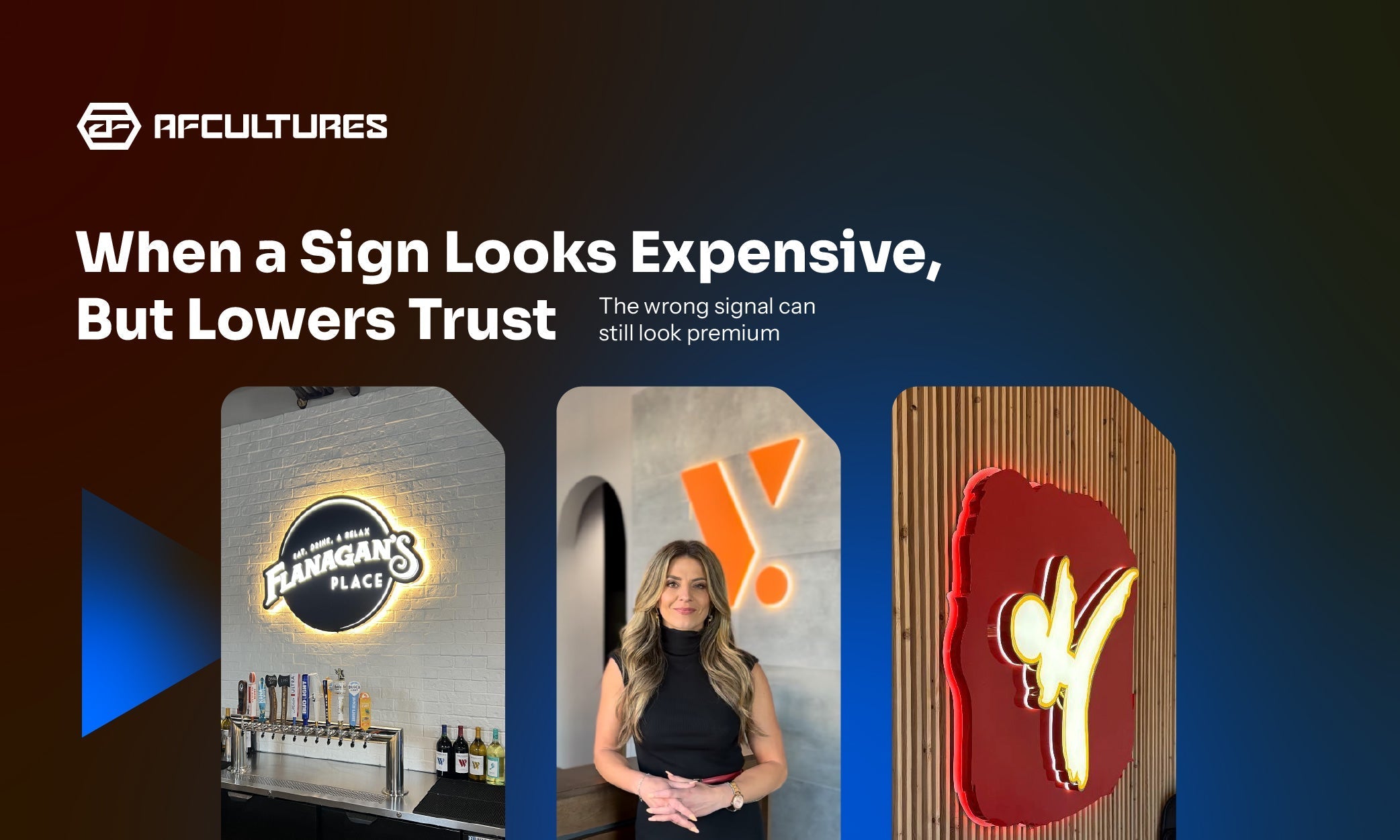
Case 1: Too Bright for Trust (The Clinic & Legal Trap)

For medical and legal spaces, a soft halo glow projects professionalism and care, rather than aggressive commercialism.
In professional environments like medical clinics, med spas, or legal offices, trust is built on calmness and precision. When a sign is too bright, with a "loud" glow effect, it creates a sense of agitation rather than serenity.
- The Mismatch: High-intensity light can feel "commercial" or "salesy" in a space where clients are looking for executive care and confidentiality.
- The AFCULTURES Fix: We recommend 2D Metal Backlit signs with controlled, warm 3500K lighting to project "Quiet Authority."
Case 2: Too Playful for Authority (The Professional Service Gap)

Thickness and material weight communicate permanence. In finance and corporate sectors, your sign is a symbol of your legacy.
For finance firms or corporate headquarters, permanence is everything. If the material feels lightweight or the form is too "experimental", the business can feel temporary.
- The Mismatch: A lightweight acrylic sign in a high-stakes investment office sends a signal of "transience" instead of "legacy."
- The AFCULTURES Fix: We advocate for heavy-duty architectural stainless steel to communicate that your business is built like a tank. stable and enduring.
Case 3: Too Cold for Hospitality (The Lifestyle Brand Barrier)

Lifestyle brands need light that invites. Soft textures and dimensional glows create an approachable premium experience.
In boutique retail or lifestyle brands, warmth and invitation are the currency.
- The Mismatch: Using cold, industrial metal or clinical lighting can make a boutique feel unapproachable or sterile.
- The AFCULTURES Fix: Integrating 3D Edgelit signs with softer, textured finishes helps bridge the gap between "premium" and "welcoming".
3. What Actually Builds Trust?

We don't just build signs. We help you choose the type of presence your business can actually wear well.
Trust isn't a result of how much you spend, it’s a result of how well you match expectations. At AFCULTURES, we help businesses achieve trust through four tactical elements:
- Controlled Light: Light that enhances the space without overwhelming the eyes.
- Category-Right Material: Using finishes that the customer subconsciously associates with your profession (e.g., Brushed Steel for Law, Polished Brass for Luxury).
- Appropriate Visual Energy: Matching the "vibe" of the sign to the psychological state of your customer.
- Spatial Context: Ensuring the sign type fits the architectural language of your lobby.
The AFCULTURES POV: We Don't Just Build Signs. We Engineer Presence.
We aren't just here to execute a design file. We are here to help you choose the type of presence your business can actually "wear" well. A sign should make your space look better, but more importantly, it should make your business feel more believable.
Is your sign sending the right signal to your clients? Consult with an AF Expert to align your signage with your industry’s trust standards.
Frequently Asked Questions
1. Can a sign really be "too premium"?
Not exactly "too premium," but it can be "wrongly premium." An expensive sign that belongs in a nightclub will lower trust if placed in a fertility clinic. It’s about relevance, not just cost.
2. How do I know if my lighting is "too loud"?
If the light creates "hot spots" on the wall or makes it difficult to read the brand name from 5 feet away, it’s distracting from your message. We specialize in Light Displacement to solve this.
3. Does material thickness affect trust?
Subconsciously, yes. Humans associate "weight" and "thickness" with stability and permanence. A thicker metal sign (1.5" - 2") often projects more authority than a flat 2D cut-out.