


How Should a Restaurant Use Illuminated Signage Without Overpowering the Space?
WHO SHOULD READ THIS
Restaurant and bar owners, operators, and designers planning an illuminated logo sign for an entrance, host area, feature wall, dining room, counter, or branded interior.
Quick Answer
An illuminated restaurant sign should create a clear focal point without becoming the brightest object in the room.
Start by deciding what the sign needs to do. An entrance sign may need immediate recognition. A feature-wall sign may need stronger visual presence. A sign near a dining area should support the atmosphere without creating glare or competing with the rest of the interior.
The right result comes from balancing four things: brand color, logo shape, lighting intensity, and placement.
Brightness is only one part of the decision.
What Does the Sign Need to Do?
The same sign can feel appropriate in one part of a restaurant and excessive in another.
| Location | Main Purpose | What to Prioritize |
|---|---|---|
| Entrance or host area | Confirm the brand as customers arrive | Clear recognition and balanced scale |
| Main feature wall | Create a memorable visual anchor | Logo shape, color, and dimensional presence |
| Behind a counter or bar | Reinforce the brand during service | Visibility without glare |
| Dining area | Support the atmosphere | Softer lighting and comfortable viewing |
| Photo wall | Create a stronger visual moment | Color, framing, and camera-friendly placement |
Before choosing a sign type, decide whether it needs to identify the business, guide attention, support the interior, or become a visual feature.
If the product direction is still unclear, compare how channel letters, backlit metal signs, and Neon Flex work in different spaces.

An illuminated sign should be evaluated against the full room, not against a blank background
Four Things to Balance
1. Brand Color Against the Real Wall
A strong brand color may look clear on a screen but behave differently once placed against tile, brick, wood, paint, or another textured surface.
The wall can affect:
- Contrast
- Reflected light
- Color appearance
- Visibility from different angles
- How wide or even the glow appears
This is especially important with halo-lit signs because the wall becomes part of the lighting effect.
A dark or textured wall may absorb and break up the glow. A smooth, light-colored wall may reflect it more widely.
That is why an illuminated sign should be reviewed on the actual wall—not only against a blank design background.
2. Typography and Logo Shape
A restaurant interior often contains menus, screens, furniture, lighting fixtures, wall graphics, and moving customers.
The sign must remain recognizable inside that visual activity.
Bold letterforms and simplified shapes usually create presence more efficiently than excessive brightness. A detailed logo may require adjustments to line thickness, spacing, depth, or construction before it can become a readable dimensional sign.
The goal is not to redesign the identity unnecessarily.
It is to make sure the logo still works when it becomes a physical object.
3. Brightness and Light Distribution
More light does not automatically create a better sign.
Excessive brightness can:
- Create glare from nearby seats
- Overexpose the wall around the sign
- Compete with menus, TVs, and interior lighting
- Make individual LED points or hot spots more noticeable
- Change the intended appearance of the brand color
- A restaurant sign should be evaluated alongside the room’s existing lighting.
Review it during the conditions in which customers will actually experience the space. A sign that feels balanced during the day may become too dominant after the surrounding lights are dimmed.
For backlit signs, the distance between the sign and the wall also affects how the halo spreads. Our guide to how a 3D backlit metal sign works explains how depth, wall surface, mounting, and lighting work together.
4. Placement and Viewing Angle
A sign should not be approved from only one straight-on view.
Customers may see it:
- While entering
- From the host desk
- From a table
- Across the bar
- While waiting for an order
- From an angle near the exit
- A placement that looks balanced from directly in front may feel too high, too small, or too bright from the customer’s actual path.
Check the sign in relation to furniture, doors, screens, lighting fixtures, wall edges, and the expected viewing distance.
A site survey before sign production can help identify these conditions before the size and mounting direction are finalized.
Planning an illuminated sign for a restaurant or bar?
Send your logo, a straight-on wall photo, wider photos of the room, approximate dimensions, and the intended sign location. The surrounding space is as important as the sign itself.
What the Game Plan Project Illustrates
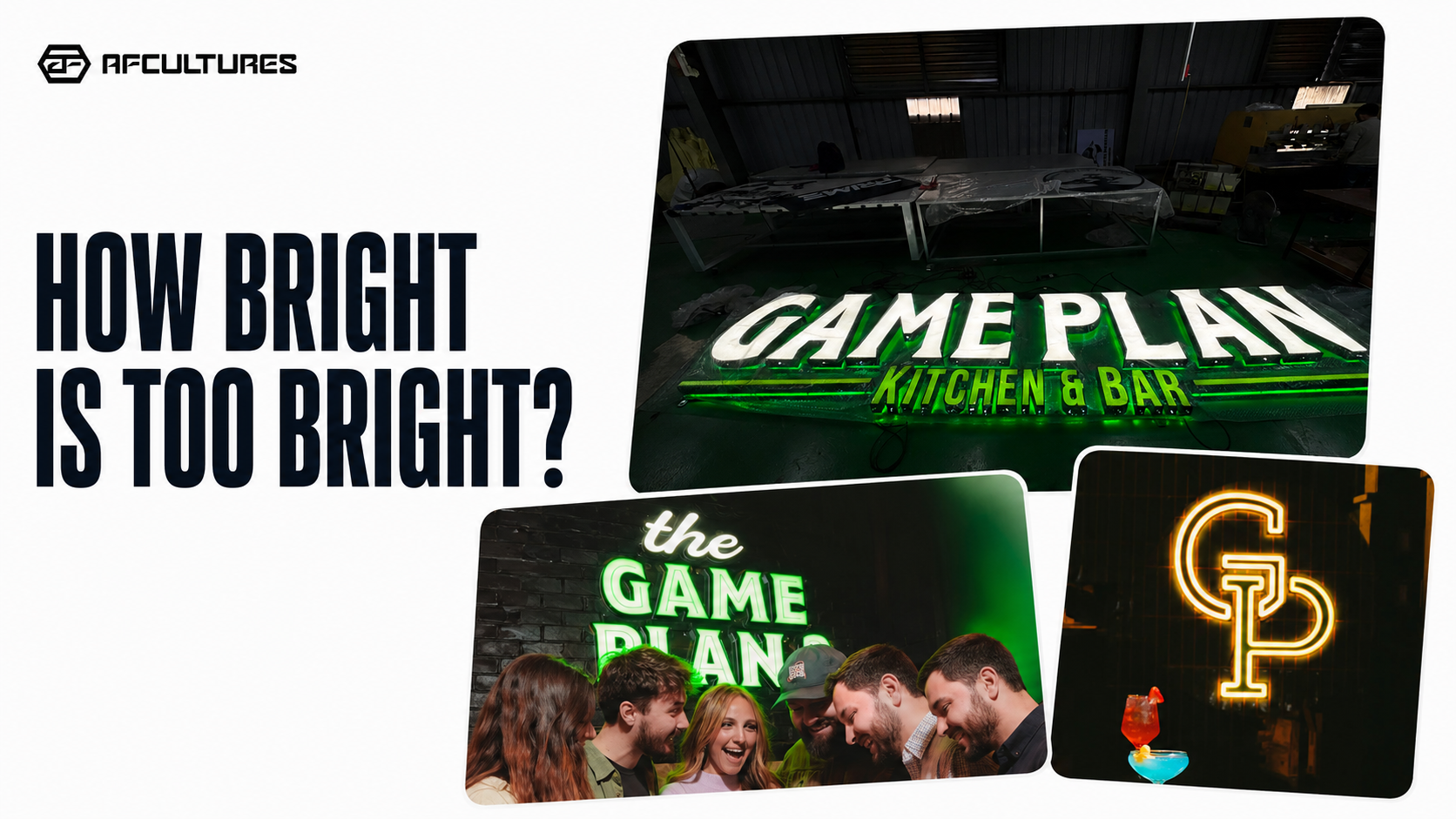
The Game Plan project provides a useful example of how several visual decisions can work together.
The indoor dimensional sign uses a recognizable green palette and bold typography to create presence. Instead of relying only on intense illumination, the lighting is kept softer and more evenly distributed around the sign.
The result demonstrates an important principle:
Make the identity bold. Do not depend on brightness alone.
Color creates contrast.
Dimensional construction gives the logo physical depth.
Lighting helps separate the sign from the wall and keeps it visible within the interior.
These elements support one another rather than forcing a single feature to do all the work.
You can view the Game Plan project to see the sign direction and its application in the space.

Brand color, dimensional form, and controlled illumination work together to create presence
Three Lessons Restaurant Owners Can Use
1. Build Presence Through More Than Lighting
A sign can attract attention through scale, shape, contrast, material depth, or a distinctive brand color.
Brightness should support those choices, not replace them.
When the logo already has strong visual character, softer illumination may be enough to separate it from the wall and establish it as a focal point.
2. Design for the Room’s Existing Energy
Restaurants and bars already contain multiple visual elements.
Before adding an illuminated sign, consider:
- Existing wall colors and materials
- TVs or digital screens
- Pendant lights and ceiling fixtures
- Menu boards
- Reflections from glass or polished surfaces
- The brightness level used during operating hours
- The sign should create a visual anchor rather than add another competing element.
3. Approve Scale on the Real Wall
Sign size should be evaluated in relation to the full installation area.
A logo may look large in a close-up mockup while still feeling undersized once furniture, ceiling height, wall width, and viewing distance are visible.
Review:
- Overall sign width and height
- Distance from wall edges
- Height above furniture or counters
- Relationship to outlets and power access
- Visibility from the main customer approach
- Space required for mounting and servicing
A technical placement image or dimensioned mockup is more useful than approving the logo alone.

Reviewing dimensions on the real wall helps confirm scale, placement, power access, and surrounding clear space before production
What Should You Review Before Production?
Before the project enters fabrication, confirm:
- The final sign size
- The exact wall location
- Wall material and condition
- Face and return colors
- Lighting direction
- Intended brightness or dimming requirements
- Power source and cable route
- Mounting method
- Access for future service
- Approval from the landlord or property manager, when required
You do not need to solve every technical detail before contacting a sign company.
However, sending the right project information helps the design and production team recommend a more realistic direction. Use this custom sign preparation checklist before requesting a quote or mockup.
Frequently Asked Questions
How bright should an indoor restaurant sign be?
There is no single brightness level that works for every interior. It depends on wall color, sign size, viewing distance, surrounding lighting, and where customers will sit or stand. The goal is clear visibility without uncomfortable glare or visible hot spots.
Where should a restaurant place an illuminated logo sign?
Common locations include the entrance, host area, behind the counter, on a main feature wall, or near a branded photo area. The best location depends on the customer journey and the role the sign needs to play.
Is a backlit sign better than a front-lit sign indoors?
Neither is automatically better. Backlighting creates a softer halo and can emphasize the wall and dimensional depth. Front lighting creates more direct visibility. The logo, wall, room lighting, and desired atmosphere should guide the decision.
What should I send before requesting a design direction?
Send your logo, a clear straight-on wall photo, wider room photos, approximate wall dimensions, indoor lighting conditions, project location, target timeline, and any landlord requirements.
Make the Sign Part of the Space
An illuminated restaurant sign should feel intentional from every important viewing angle, not added after the room is already complete.
Send AFCULTURES your logo, wall photos, and project goals. We can help visualize the sign in the real environment, review the lighting direction, and develop a solution that fits both the brand and the space.
For projects involving several areas of a restaurant or commercial interior, start with a commercial signage plan.


