Why Business Signs Look Different in Reality And How to Fix It
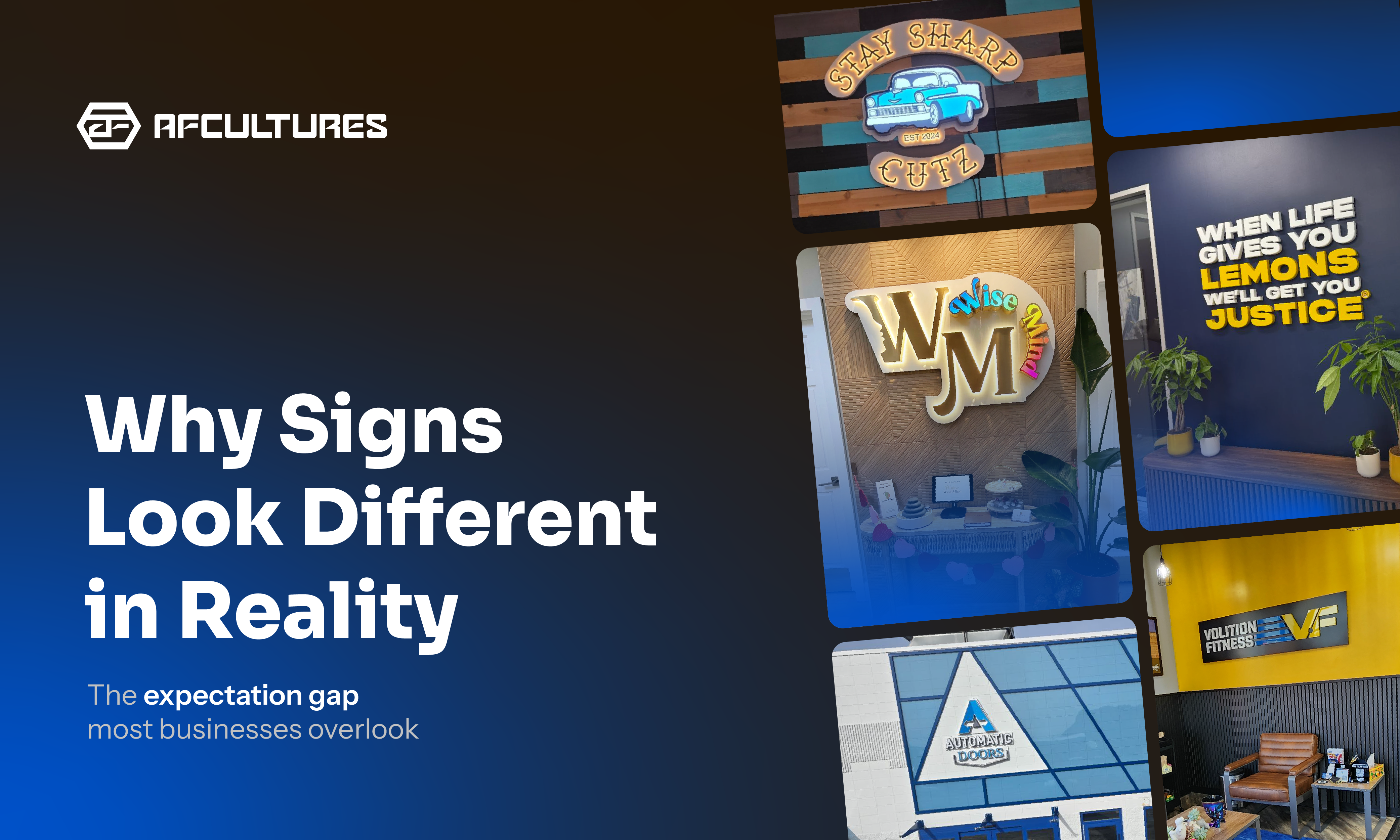
Designing a business sign often begins with a clear vision. Everything looks right on screen. But once the sign is installed, many businesses notice something unexpected, it doesn’t look the way they imagined.
This difference is what we call the “Expectation Gap”.
It happens because signage doesn’t exist on a screen. It exists in the real environment, where lighting, materials, scale, and context shape how it is perceived.
What Creates the Expectation Gap?
Most signage projects begin with digital mockups or flat drafts. These tools are useful for planning, but they rarely capture how signage behaves once it becomes a physical object installed in a real environment.
In most projects, the gap between expectation and reality usually comes from four key factors:
- Color in context: Colors on screen can appear different once they interact with real surfaces, lighting, and finishes
- Scale and viewing distance: Signage often feels smaller or larger depending on the architectural space around it
- Depth and shadows: Dimensional signage introduces shadow and visual weight that flat designs cannot fully represent
- Material finishes: Metals, coatings, and fabrication details influence how the sign looks and performs over time
Understanding these factors early in the design process helps businesses make better decisions before fabrication begins.
1. Color Changes in Context

Lighting and surface texture can significantly change how colors appear in real space.
Colors displayed on screens are created using light. Signage materials, however, rely on physical pigments, coatings, and finishes.
When these materials interact with natural sunlight, artificial lighting, and surrounding surfaces, the result can look different from what appeared in the original design file.
For example:
-
Glossy finishes may reflect light and appear brighter during the day
- Matte finishes may absorb light and appear slightly darker
- Surrounding surfaces such as brick, wood, or concrete can influence how colors are perceived
A brand color that looks vibrant on a white digital background may feel completely different once placed against a textured wall or exterior facade.
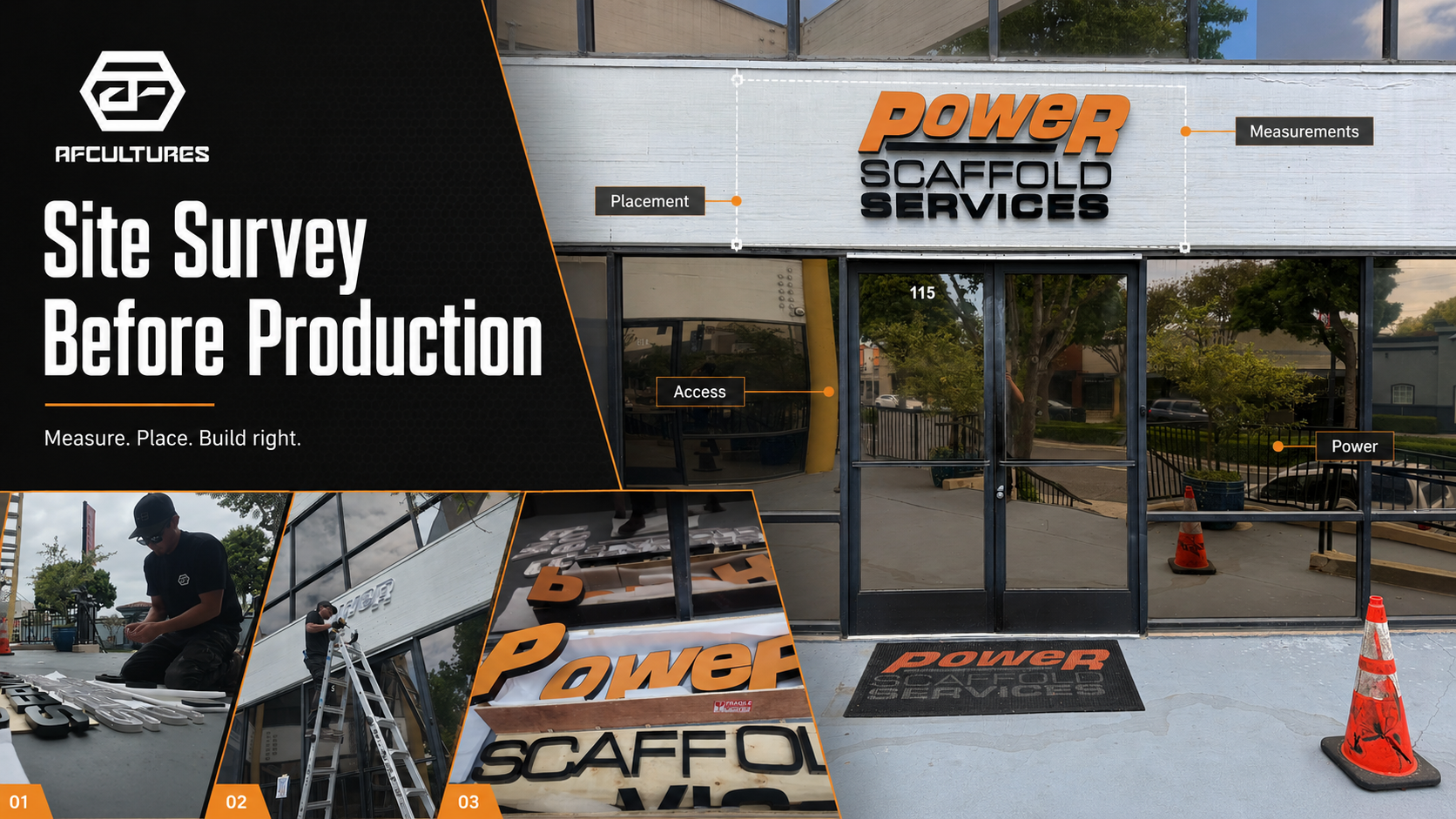
2. Scale Looks Different in Real Space
 Sign size must be considered in relation to the surrounding space, not just the design file
Another common reason signs appear different after installation is scale.
In design software, designers often zoom in closely while reviewing a logo or layout. What feels large and bold on screen may appear surprisingly small once installed on a large facade or interior wall.
The human eye perceives size relative to its surroundings. A sign placed near a tall entrance door, a wide storefront, or a large reception wall must be designed differently than something viewed from only a few feet away.
When determining signage size, designers typically consider:
- Viewing distance from the sidewalk or street
- Surrounding architectural elements
- The overall visual balance of the wall or facade
Ignoring these contextual factors is one of the most common reasons signage feels “underwhelming” after installation.
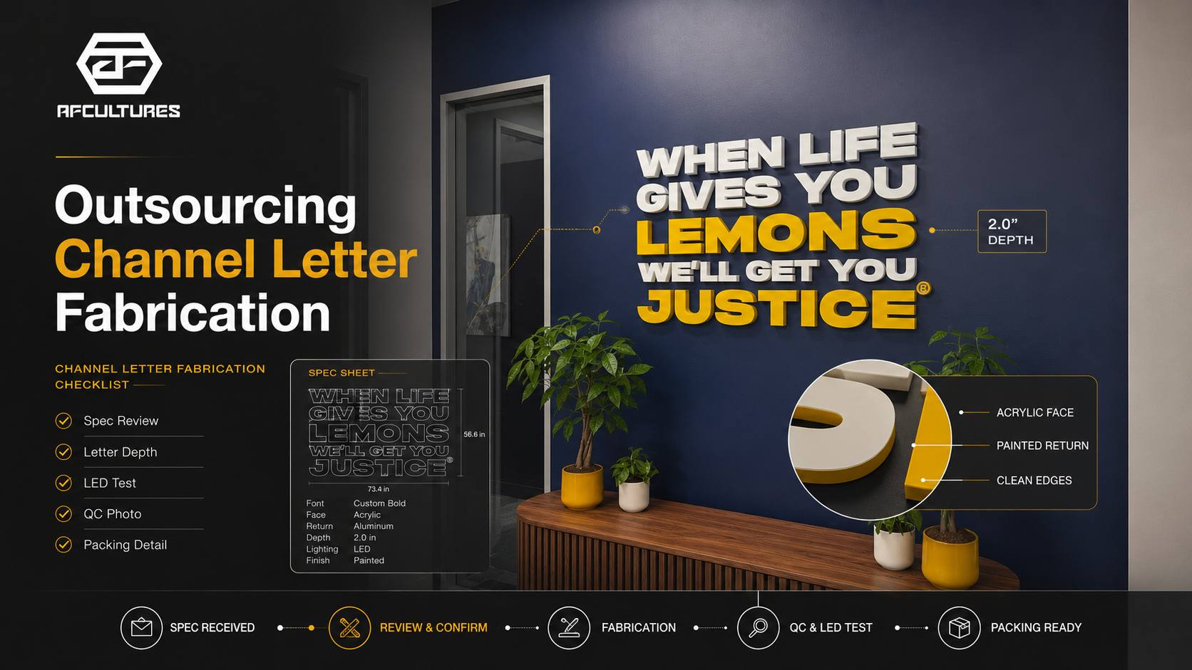
3. Depth Adds More Than Dimension
 Dimensional signage creates shadows and visual weight that flat designs can’t fully capture
Many custom signs are not flat graphics but three-dimensional objects. Dimensional lettering, raised mounting systems, and metal fabrication all introduce depth into the design.
Depth can significantly improve how signage feels within a space. It adds shadow, contrast, and a sense of craftsmanship that flat graphics cannot achieve.
However, depth also introduces visual effects that are difficult to judge in flat designs.
For example:
- Raised letters create natural drop shadows behind the sign
- Directional lighting can highlight or obscure certain details
- Thin typography may appear less readable once shadows are introduced
Without considering these factors during the design phase, the final installation may behave differently than expected.
4. Materials Influence the Final Perception
 Materials and finishes affect both the appearance and durability of signage over time
Finally, the materials used in signage affect both appearance and long-term performance.
Different metals, coatings, and fabrication methods interact with the environment in different ways. A design that looks perfect on screen must also function under real conditions such as sunlight, weather exposure, and daily wear.
Professional signage design typically considers:
- Metal thickness and structural integrity
- Surface finishes and coatings
- Durability against weather conditions
- Mounting systems and installation methods
When material decisions are made early in the process, the final result is much more predictable both visually and structurally.
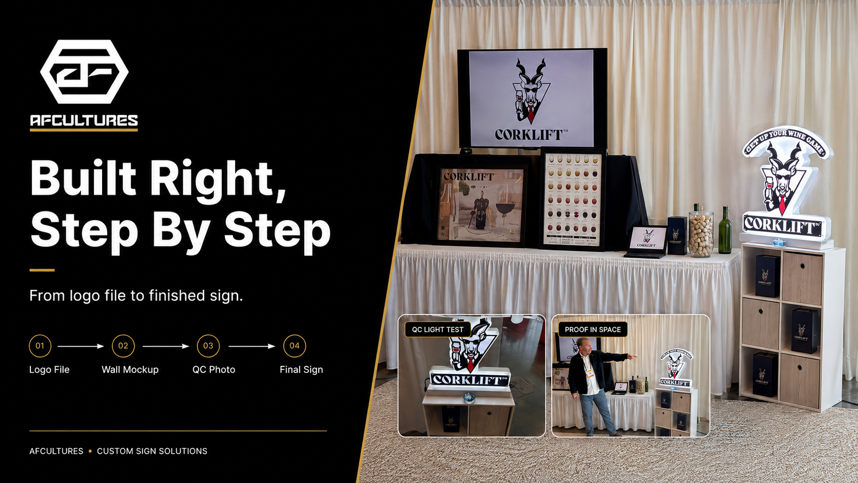
How Businesses Can Avoid the Expectation Gap
 Seeing your sign in context before production helps reduce the gap between expectation and reality
Fortunately, most signage surprises can be avoided when the design process evaluates the sign within its real environment before production begins.
In practice, this comes down to how early and how clearly a business can see the sign in context, not just as a design, but as part of a real space.
Some practical steps include:
1. Review designs in architectural context
Instead of approving a design on a blank background, the signage should be evaluated against the actual building surface or interior space where it will be installed.
2. Consider viewing distance early
The sign should remain legible and visually balanced from where customers will actually experience it, whether that’s across a room or from the street.
3. Use realistic visualization, not just flat drafts
This is where the biggest difference is made.
Rather than relying only on static 2D designs, a realistic preview allows businesses to understand how scale, lighting, and materials will behave in the space.
At AFCULTURES, this step is built directly into the design process. Using rapid visualization tools, we can generate a contextual preview of the signage within seconds, even during a live discussion, allowing clients to see how their brand will appear in the actual environment before production begins.
4. Discuss materials during the design phase
Material choices should not be an afterthought. They influence both the visual outcome and how the signage performs over time.
When these steps are incorporated into the process, especially when visualization is treated as a core part of decision-making, businesses are far more likely to achieve a final result that matches their original vision.
How to Choose the Right Signage Company
One of the most common questions businesses ask is: How do you choose the right signage company?
In practice, the answer goes beyond design or price.
A reliable signage partner should be able to:
- Help you visualize how your sign will look in the actual space before production
- Ensure accuracy with your brand guidelines, including color, proportion, and typography
- Consider how the sign interacts with lighting, materials, and architectural context
-
Take ownership of both design and execution, not just fabrication
Many signage providers focus primarily on production. However, without proper visualization and context, even a well-built sign may not deliver the intended brand impact.
At AFCULTURES, we approach signage differently. Rather than treating it as a standalone product, we treat it as part of the overall brand environment, ensuring what is designed is as close as possible to what is experienced in reality.
FAQs
1. Why do business signs look different after installation?
Because signs are experienced in a real environment. Lighting, scale, materials, and surroundings all affect how they appear compared to a design file.
2. How can I preview my signage before it’s built?
Use realistic visualization instead of flat mockups. At AFCULTURES, this can often be done in seconds, even during a live discussion.
3. What should I look for in a signage company?
Choose a partner who can visualize your sign in context, follow brand guidelines accurately, and take ownership from design to installation.
Conclusion
The difference between a design file and a finished sign is common, but it’s also preventable when decisions are made with the real environment in mind.
Because signage is not just a graphic on a wall. It is often the first physical representation of the brand.
At AFCULTURES, we approach signage as part of that environment, helping businesses visualize, refine, and execute their brand presence with greater clarity from the start.