How Big Should Your Business Sign Be? A Simple Readability Guide For Owners
How Big Should Your Business Sign Be? A Simple Readability Guide For Owners
Choosing the right business sign size is not just about filling an empty wall.
A sign can be beautifully made and still fail if customers cannot read it quickly, see it from the right distance, or understand it in the real environment.
A lobby sign that looks perfect on a screen may feel too small once installed behind a reception desk. A storefront sign that looks bold in a mockup may still be hard to read from the parking lot. A sign that fills the wall may look impressive, but it may overpower the space instead of supporting the brand.
So before asking, “How big should my sign be?” business owners should ask a better question:
How far away will people need to read it?
This guide explains how to think about business sign size using viewing distance, letter height, wall proportion, lighting, and real-space context.
Quick Answer: How Big Should A Business Sign Be?
A custom business sign should be large enough to be read quickly from the intended viewing distance, but balanced enough to fit the wall, storefront, or interior space where it will be installed.
The right sign size depends on:
- Viewing distance
- Letter height
- Wall or storefront size
- Indoor or outdoor placement
- Customer movement
- Lighting
- Background contrast
- Logo complexity
- Installation height
- Whether the sign is meant for visibility, branding, wayfinding, or photo impact
There is no single size that works for every business.
A good sign size is based on how the sign will be seen in real life.
Start With Viewing Distance, Not Wall Size
Many business owners start with the wall.
They look at an empty surface and ask, “How much of this wall should the sign cover?”
That matters, but it should not be the first question.
The first question should be:
Where will people be standing when they need to read the sign?
For an indoor lobby sign, customers may read it from 5 to 15 feet away.
For a retail wall sign, people may see it from the entrance, checkout area, or across the room.
For a storefront sign, customers may see it from the sidewalk, parking lot, street, or inside a moving car.
For a large outdoor business sign, people may need to recognize the brand before they are directly in front of the building.
The farther away the viewer is, the larger the letters usually need to be.
This is why sign sizing should begin with the viewing distance, not just the wall dimensions.
The 3-Second Rule For Sign Readability
A business sign should not make people work too hard.
In many real-world situations, people only glance at a sign for a few seconds. They may be walking into a store, driving past a plaza, looking across a lobby, or scanning a street for the right business.
That means the sign should be readable fast.
A useful way to think about this is the 3-second rule:
Can someone understand the sign within a few seconds from the normal viewing distance?
If the answer is no, the sign may have a readability problem.
Common causes include:
- Letters that are too small
- Thin strokes that disappear from a distance
- Low contrast between the sign and the wall
- Too many words
- Overly detailed logos
- Poor lighting
- Incorrect placement
- Visual clutter around the sign
A sign does not need to shout.
But it does need to be recognized quickly.
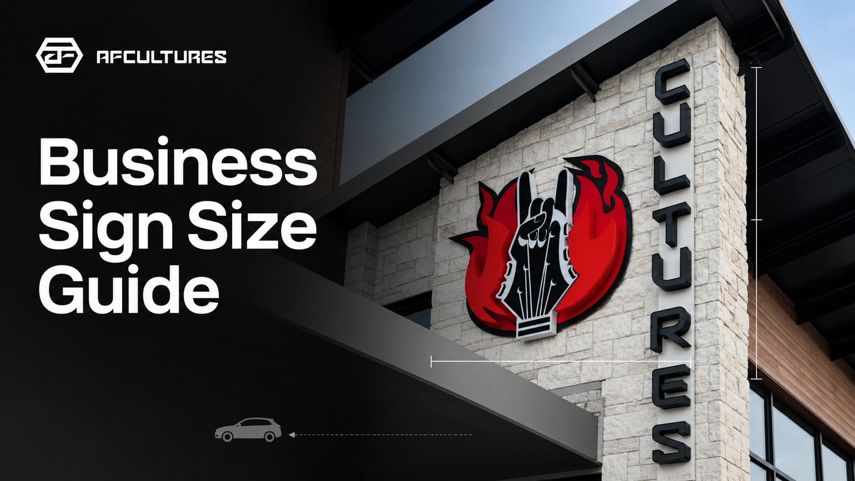
Letter Height Matters More Than Most Owners Think
Letter height is one of the most important factors in sign readability.
As a general rule of thumb, every 1 inch of letter height supports about 10 feet of strong viewing distance.
That means:
| Viewing Distance | Suggested Letter Height |
|---|---|
| 10 feet | Around 1 inch |
| 20 feet | Around 2 inches |
| 30 feet | Around 3 inches |
| 50 feet | Around 5 inches |
| 100 feet | Around 10 inches |
This is not a fixed rule for every project. It is a planning guide.
Real sign size also depends on font style, letter thickness, logo shape, lighting, color contrast, and whether people are walking or driving.
For example, a thin elegant script may need more size than a bold sans serif font. A low-contrast sign may need stronger lighting or larger letters. A sign viewed by moving traffic may need to be simpler and larger than a sign viewed inside a lobby.
The goal is not only to make the sign visible.
The goal is to make it readable at the moment customers need to recognize it.

Indoor Sign Size Vs. Outdoor Sign Size
Indoor and outdoor signs are sized differently because people experience them differently.
Indoor Business Signs
Indoor signs are often used for:
- Reception areas
- Lobby walls
- Salon walls
- Office branding
- Gym interiors
- Restaurant feature walls
- Retail checkout areas
- Photo-friendly brand moments
For indoor signs, size should balance readability with interior design.
A sign may not need to be extremely large if customers see it up close. But it should still feel intentional in the space.
Indoor sizing should consider:
- Wall width
- Ceiling height
- Furniture placement
- Reception desk or counter size
- Customer entry path
- Eye-level visibility
- Background color
- Lighting in the room
- Whether the sign is also used as a photo backdrop
A small sign on a large empty wall may feel weak.
A very large sign above small furniture may feel heavy.
The best indoor sign size usually feels proportional to the wall and the business environment.
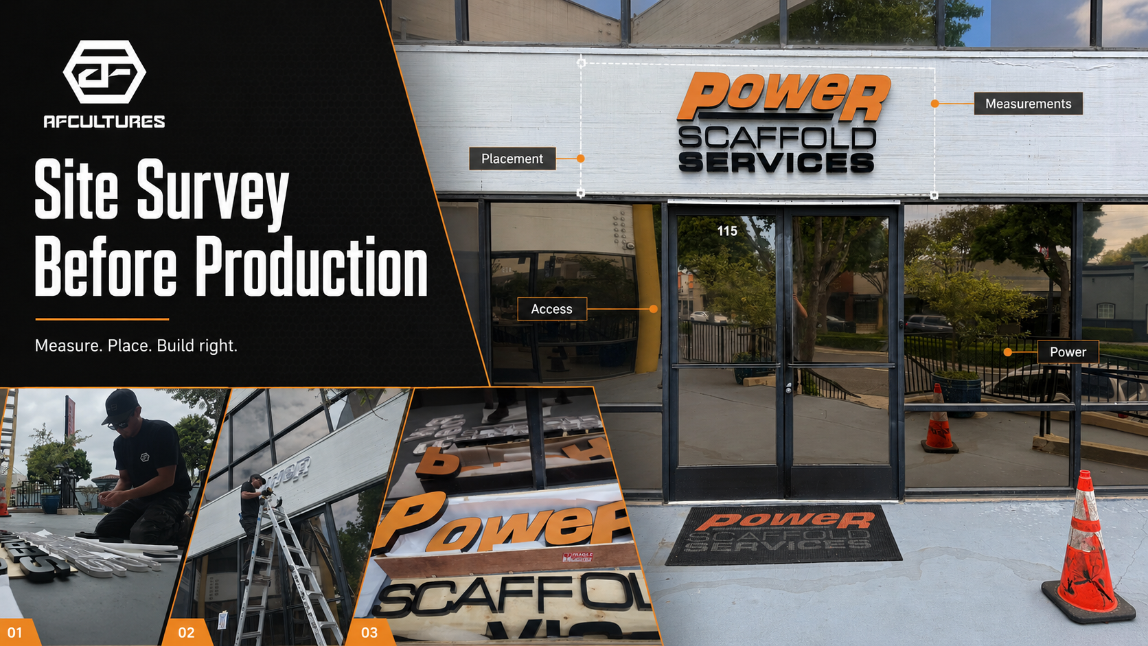
Outdoor Business Signs
Outdoor signs are often used for:
- Storefronts
- Building facades
- Shopping plazas
- Restaurants
- Gyms
- Clinics
- Salons
- Retail stores
- Office buildings
Outdoor signs need to work harder because customers may see them from farther away.
Outdoor sizing should consider:
- Street visibility
- Parking lot distance
- Sidewalk distance
- Speed of passing traffic
- Building width
- Neighboring signs
- Door and window placement
- Lighting conditions
- Local or property signage rules
- Installation height
For outdoor signs, the goal is often recognition before arrival.
If customers only notice the sign when they are already at the door, the sign may not be doing enough for visibility.

Bigger Is Not Always Better
A common mistake is assuming the largest possible sign is automatically the best choice.
That is not always true.
A sign can be too large for the space.
When a sign is oversized, it may:
- Feel forced onto the wall
- Overpower the interior
- Look less premium
- Conflict with furniture or architecture
- Create awkward lighting
- Become harder to install
- Increase cost without improving clarity
The best sign size is not the biggest size.
It is the size that creates the clearest brand presence in the actual environment.
A premium business sign should feel like it belongs in the space.
Not like it was added as an afterthought.
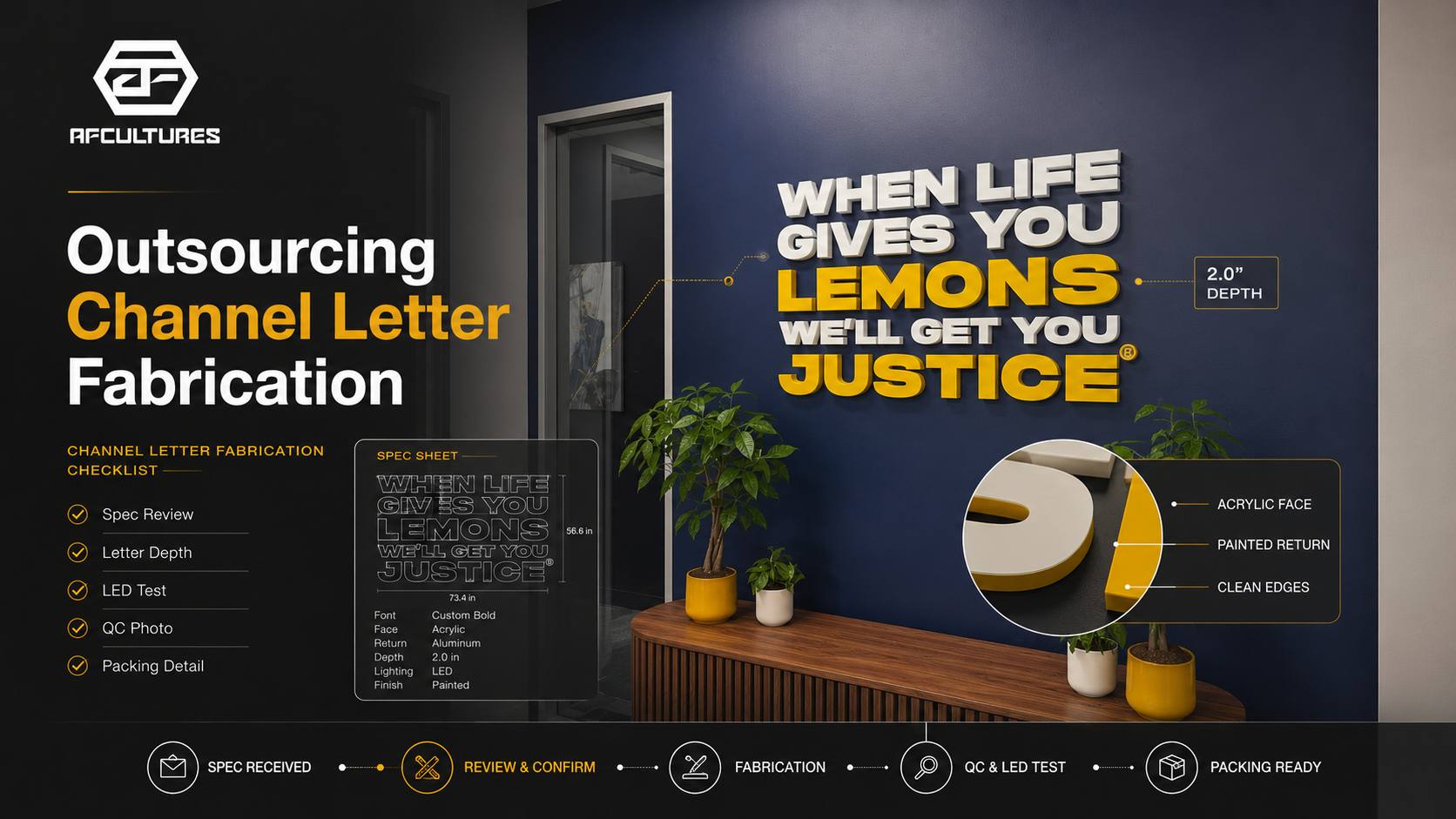
Why Logo Complexity Affects Sign Size
Not all logos read the same at the same size.
A simple wordmark with bold letters may stay readable even when smaller.
A detailed logo with thin lines, icons, small text, or script lettering may need more size to remain clear.
Before choosing sign size, look at the logo carefully.
Ask:
- Are the letters thick enough?
- Are there small details?
- Is there a tagline?
- Does the logo include thin script?
- Does the icon need to be visible from far away?
- Will the sign be illuminated?
- Will any details be difficult to fabricate?
Sometimes, the best solution is not only to increase the sign size.
It may be better to simplify the layout, remove small text, adjust spacing, or separate the icon from the wordmark.
This does not mean changing the brand.
It means translating the brand into a physical sign that can be read and built properly.
Lighting Can Change How Large A Sign Feels
Lighting affects how a sign is perceived.
An illuminated sign can feel visually stronger than a non-illuminated sign of the same size.
A backlit sign may create a soft halo around the letters, making the sign feel more dimensional. A front-lit sign may create stronger direct visibility. A non-illuminated sign may rely more heavily on material, contrast, and room lighting.
This is why size and lighting should be planned together.
A sign that looks subtle during the day may become much stronger at night. A sign that looks balanced in a mockup may feel too bright if the surrounding wall is glossy or dark. A sign that is too small may still become readable with the right contrast and lighting, but only if the design supports it.
The best lighting choice depends on the wall, business type, viewing distance, and customer experience.
Wall Proportion Still Matters
Viewing distance tells you how readable the sign needs to be.
Wall proportion tells you how balanced the sign will feel.
For indoor wall signs, a useful starting point is to think about how much of the wall or furniture width the sign should occupy.
A sign above a reception desk, for example, should usually feel connected to the furniture below it. If the sign is too narrow, it may look disconnected. If it is too wide, it may feel heavy.
For a blank feature wall, the sign should have enough space around it to breathe.
Good wall proportion considers:
- Wall width
- Wall height
- Furniture width
- Ceiling height
- Negative space
- Nearby doors and windows
- Other wall elements
- Viewing angle
A sign needs space around it.
A strong sign does not have to touch every edge of the wall to feel important.
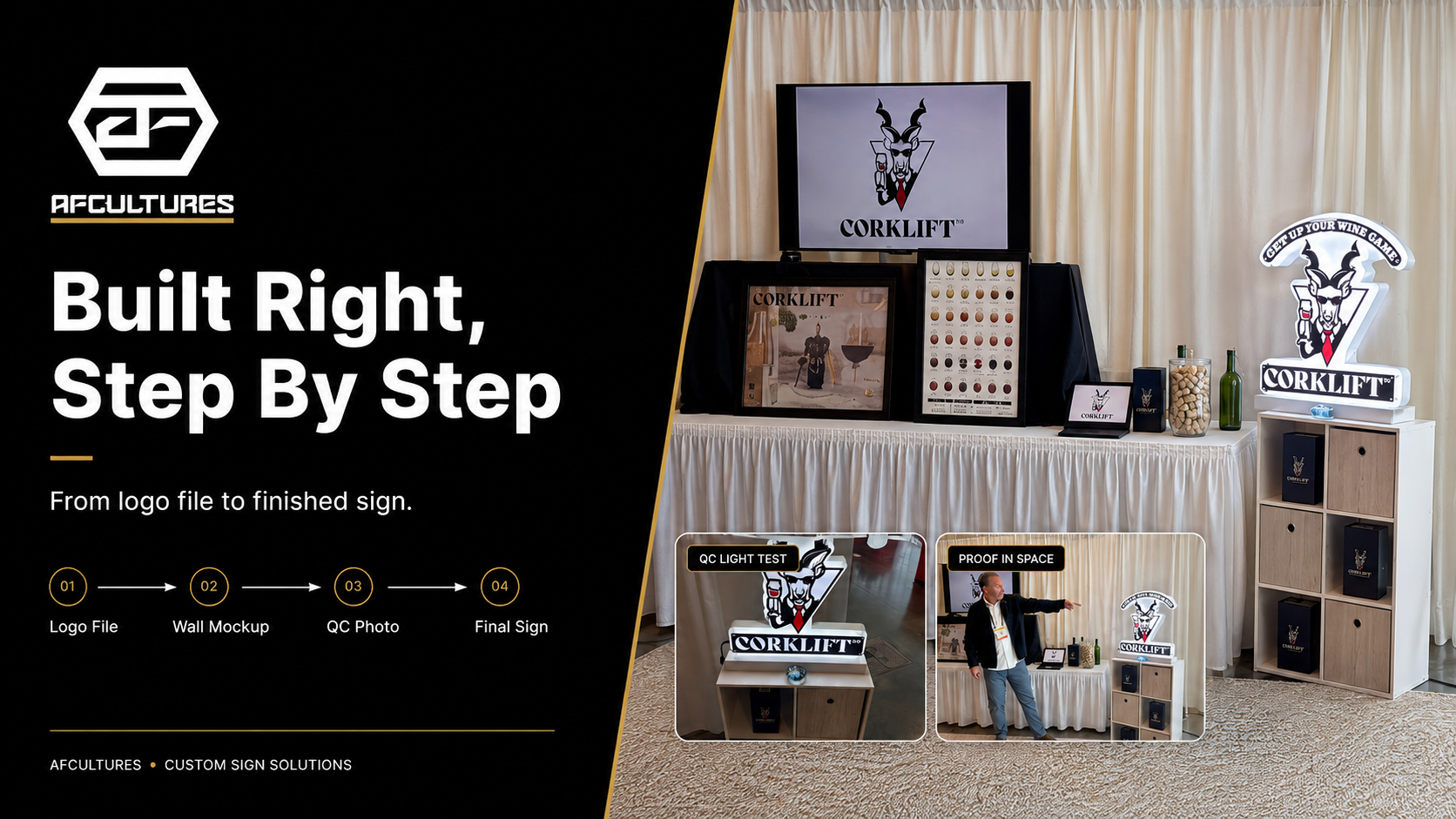
Why A Mockup Helps Prevent Wrong Sizing
A mockup is one of the most useful tools for choosing sign size.
Without a mockup, business owners often imagine the sign in isolation. They see the logo file and try to guess how it will look in the real space.
But a real sign is never seen in isolation.
It is seen on a wall, above furniture, near lighting, beside doors, inside a room, or across a storefront.
A realistic mockup helps answer:
- Does the sign feel too small?
- Does it feel too large?
- Is the placement balanced?
- Is the logo readable?
- Does the lighting direction make sense?
- Does the sign fit the wall color and material?
- Does it support the brand atmosphere?
- Will customers see it from the right angle?
A good mockup does not replace production expertise, but it helps reduce guesswork before the sign is built.
For custom signs, this step can prevent expensive sizing mistakes.

What To Send Before Choosing Your Sign Size
You do not need to know the perfect size before reaching out.
But you should send enough context for the sign team to recommend the right direction.
Before choosing sign size, prepare:
| What To Send | Why It Helps |
|---|---|
| Logo file | Helps review shape, letter style, and production complexity |
| Wall or storefront photo | Shows the real installation environment |
| Approximate wall width | Helps estimate proportion and scale |
| Viewing distance | Helps determine readability needs |
| Preferred sign location | Helps plan placement and balance |
| Indoor or outdoor use | Affects size, lighting, material, and mounting |
| Business type | Helps match sign presence to brand experience |
| Lighting preference | Helps understand visual impact |
| Project location | Helps with outdoor planning and possible property requirements |
| Timeline | Helps plan design, production, and installation |
The more context you provide, the more accurate the recommendation can be.
A sign should be sized for the real business environment, not just the logo file.
How AFCULTURES Helps Business Owners Choose The Right Sign Size
At AFCULTURES, sign sizing is not treated as a random number.
It is part of the design and production process.
A good custom sign should consider:
- How far away customers will view it
- How quickly it needs to be recognized
- Whether it will be installed indoors or outdoors
- How the logo reads at different sizes
- How the wall or storefront affects scale
- How lighting changes visual weight
- How materials and thickness affect the final look
- How installation height and placement affect visibility
The goal is not only to make a sign that looks good in a product photo.
The goal is to make a sign that works in the actual space.
That is why AFCULTURES asks for details like logo files, wall photos, approximate sign size, installation location, and project context before production.
The right size helps the sign feel intentional, readable, and aligned with the business.
Final Thought: The Right Sign Size Starts With Real Context
The right business sign size is not chosen by guessing.
It starts with real context.
How far away will customers see it?
How fast do they need to recognize it?
Where will the sign be installed?
How much wall space is available?
Will it be lit?
Will it be seen indoors, outdoors, or from a moving car?
Does the logo stay readable at that size?
A strong sign should not only fill space.
It should create clear brand presence in the right place, at the right scale, for the right audience.
If you are planning a custom business sign, start with your logo, wall photo, viewing distance, installation location, and preferred timeline.
AFCULTURES can help you choose a sign size that fits the space before production begins.
Frequently Asked Questions
How big should my business sign be?
Your business sign should be large enough to be readable from the intended viewing distance while still feeling balanced in the installation space. The right size depends on viewing distance, wall size, letter height, lighting, placement, and whether the sign is indoors or outdoors.
How tall should letters be on a business sign?
A common rule of thumb is about 1 inch of letter height for every 10 feet of viewing distance. However, the best letter size also depends on font style, contrast, lighting, logo complexity, and whether people are walking or driving past the sign.
How big should an indoor lobby sign be?
An indoor lobby sign should be sized around the wall, reception desk, furniture, ceiling height, viewing distance, and customer entry path. It should feel visible and intentional without overpowering the interior.
How big should a storefront sign be?
A storefront sign should be readable from the sidewalk, parking lot, street, or the distance where customers first need to recognize the business. Storefront sign size may also be affected by building width, neighboring signs, landlord rules, city requirements, and lighting.
Is a bigger sign always better?
No. A sign that is too large can overpower the space, look less premium, increase cost, and create installation or lighting issues. The best size is the one that fits the real viewing distance and the physical environment.
Why should I send a wall photo before choosing sign size?
A wall photo helps the sign team understand the real space, including wall width, furniture, lighting, background color, texture, and viewing angle. This helps prevent a sign from looking too small, too large, or misplaced after installation.
Can a mockup help me choose the right sign size?
Yes. A realistic sign mockup helps preview scale, placement, wall balance, and readability before production. It is one of the best ways to reduce guessing when choosing a custom business sign size.
Ready To Find The Right Sign Size For Your Space?
Your sign size should not be a guess.
Send us your logo, wall photo, viewing distance, and project location. AFCULTURES will help you review the space and recommend a sign direction that fits your business before production begins.