News
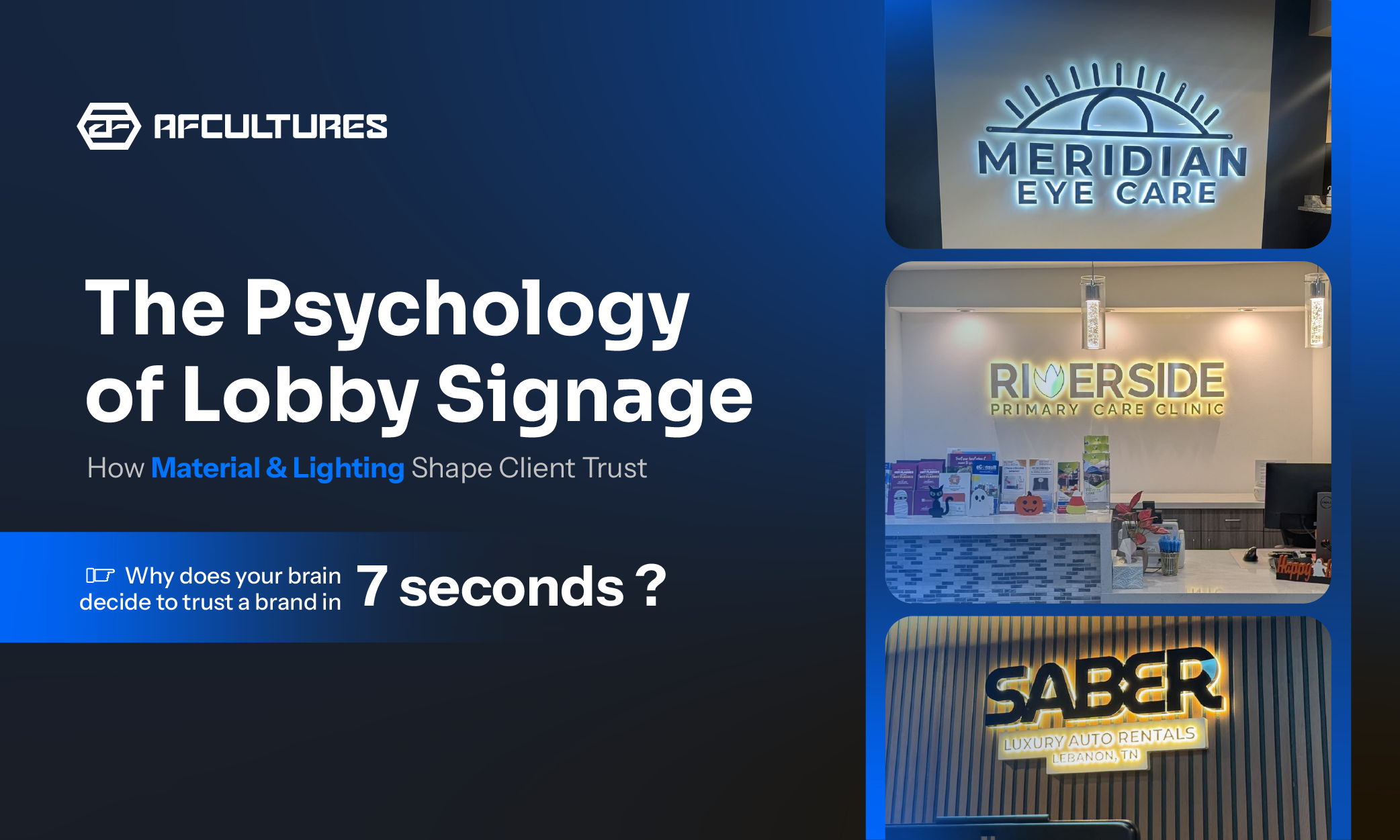
The Psychology Of Lobby Signage: How Material And Lighting Shape Client Trust
Most businesses view a lobby sign as a static construction item. Neuroscience says it’s your brand’s first physical handshake. Learn how the subtle interplay of materials and light can turn a 7-second encounter into a lifetime of trust. Why Does The Brain Decide To Trust A Brand In 7 Seconds? When a client walks into a lobby, their "System 1" (the intuitive, instinctive brain) takes over. Before a single word is spoken or a handshake is exchanged, the environment has already signaled whether this business is professional, stable, or innovative. As the focal point of the reception area, the lobby sign carries the weight of this split-second judgment. It is the "anchor" of your brand’s physical presence. 1. The "Halo Effect": The Neuroscience of Prestige There is a biological reason why premium brands almost exclusively favor Backlit (Halo-lit) signage. Humans are naturally drawn to light, but we are subconsciously repelled by harsh glare. In psychology, the "Halo Effect" occurs when one positive trait (like a sophisticated, beautifully lit sign) influences how people perceive the entire company. A soft, indirect glow triggers a sense of safety and prestige. It suggests a brand that is successful enough to care about the details, whereas poor lighting can signal a lack of refinement or an "unfinished" business identity. Backlit illumination: Creating a psychological "comfort zone" that radiates prestige 2. Material Language: The Voice of Engineered Illumination In the premium signage world, we don't just pick materials based on what’s available. We pick them based on the "vibe" they project. At AFCULTURES, we specialize in the mastercraft of Engineered Hybrid Construction: combining the authority of Stainless Steel with the vibrant energy of High-grade Acrylic. Premium Stainless Steel (The Voice of Authority): A solid metal front face triggers a sense of permanence and strength. This is the choice for Law Firms, Real Estate Developers, and Financial Institutions. It projects a brand that is solid and established. Stainless Steel: The choice for Law & Finance to project absolute stability Illuminated Acrylic Surface (The Voice of Innovation): When a brand needs to glow, the Acrylic takes the lead. It allows for perfect light diffusion, making it ideal for Tech Hubs, Creative Agencies, and Modern Retailers that want to project transparency and forward-thinking. Illuminated Acrylic: Best for Tech & Creative brands to signal innovation Mastered Hybrid Engineering: Most of our high-end projects use both. An Inox face for a premium, solid feel, seamlessly integrated with a high-diffusion Acrylic back or edge for that signature Halo Effect. This unified approach says your brand is both traditional in its values and modern in its execution. The Hybrid Build: Premium balance for Med Spas and Luxury Corporate offices 3. Spatial Harmony: Why a Sign Must "Belong" A sign should never look like an afterthought "slapped" onto a wall. Professional signage specialists approach a lobby from an Architectural Mindset. True spatial harmony happens when the signage is engineered to fit the lobby’s specific context, matching the wall's texture and the room's color temperature (Kelvin). If the interior uses warm 3000K lighting, the sign’s LEDs must match perfectly. If they don't, it creates "visual friction," a subconscious red flag that signals a lack of attention to detail to the visitor. >>> Related Reading: Why Business Signs Look Different in Reality Architectural Integration: Engineered to match your lobby’s unique Kelvin and texture. 4. The Gold Standard: Extreme Ownership In the U.S. signage market, "close enough" is a liability. For high-profile brands, even a 1% deviation in a logo’s curve or a 2-degree shift in color can lead to brand dilution or legal risks. Leading partners like AFCULTURES operate with an Extreme Ownership model. By managing the process in-house, from the initial 3D visualization to the final installation, the risk of "expectation vs. reality" is eliminated. This ensures that the final physical result is a perfect manifestation of the brand’s legal identity, protecting the founder’s vision at every step. Extreme Ownership: 100% brand integrity from digital render to physical install FAQs Does lighting color matter? Yes. 3000K (Warm) is welcoming; 6000K (Cool) is clinical. It must match your interior to look professional. How accurate is the final sign? With in-house mastery, the goal is 100%. We engineer the production to fit your vector, not the other way around. Why invest in a 3D preview? 2D drafts can’t show shadow depth or light interaction. 3D allows you to see the sign "live" in your space before production begins. Conclusion: More Than a Sign, It’s a Legacy Designing a lobby sign is not merely a task of cutting metal or wiring LEDs. It is an exercise in architectural psychology. From the stability of Stainless Steel to the vibrant energy of High-diffusion Acrylic, every material choice is a strategic communication of your brand's values. When you achieve Spatial Harmony, where lighting, texture, and geometry align, your lobby ceases to be just an entrance. It becomes a powerful physical handshake that builds trust before you even speak. At the end of the day, your brand deserves a presence that is as precise, ambitious, and enduring as your business itself. 👉 Visualizing your brand’s physical presence shouldn't be a guessing game. Let’s build your reality together.
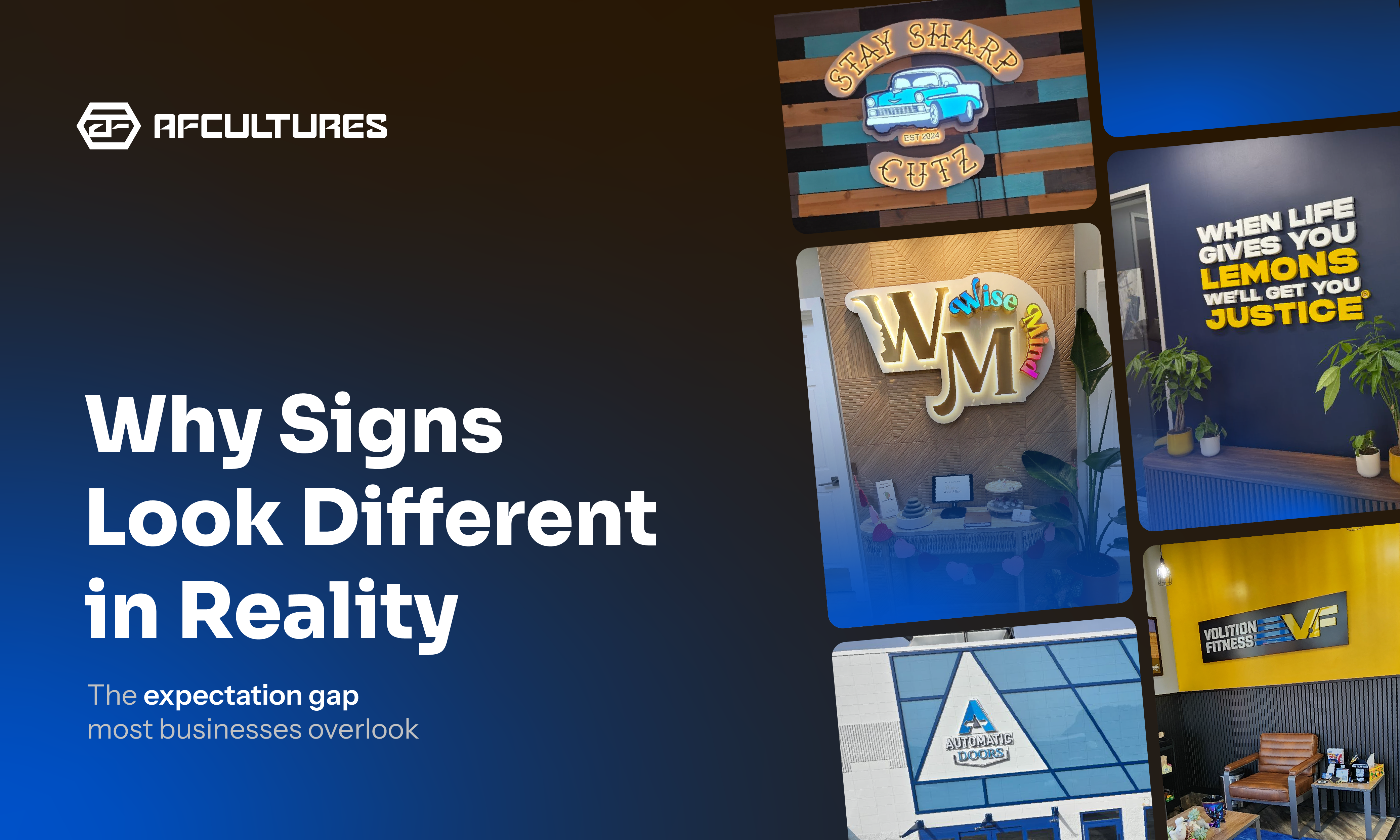
Why Business Signs Look Different in Reality And How to Fix It
Designing a business sign often begins with a clear vision. Everything looks right on screen. But once the sign is installed, many businesses notice something unexpected, it doesn’t look the way they imagined. This difference is what we call the “Expectation Gap”. It happens because signage doesn’t exist on a screen. It exists in the real environment, where lighting, materials, scale, and context shape how it is perceived. What Creates the Expectation Gap? Most signage projects begin with digital mockups or flat drafts. These tools are useful for planning, but they rarely capture how signage behaves once it becomes a physical object installed in a real environment. In most projects, the gap between expectation and reality usually comes from four key factors: Color in context: Colors on screen can appear different once they interact with real surfaces, lighting, and finishes Scale and viewing distance: Signage often feels smaller or larger depending on the architectural space around it Depth and shadows: Dimensional signage introduces shadow and visual weight that flat designs cannot fully represent Material finishes: Metals, coatings, and fabrication details influence how the sign looks and performs over time Understanding these factors early in the design process helps businesses make better decisions before fabrication begins. 1. Color Changes in Context Lighting and surface texture can significantly change how colors appear in real space. Colors displayed on screens are created using light. Signage materials, however, rely on physical pigments, coatings, and finishes. When these materials interact with natural sunlight, artificial lighting, and surrounding surfaces, the result can look different from what appeared in the original design file. For example: Glossy finishes may reflect light and appear brighter during the day Matte finishes may absorb light and appear slightly darker Surrounding surfaces such as brick, wood, or concrete can influence how colors are perceived A brand color that looks vibrant on a white digital background may feel completely different once placed against a textured wall or exterior facade. 2. Scale Looks Different in Real Space Sign size must be considered in relation to the surrounding space, not just the design file Another common reason signs appear different after installation is scale. In design software, designers often zoom in closely while reviewing a logo or layout. What feels large and bold on screen may appear surprisingly small once installed on a large facade or interior wall. The human eye perceives size relative to its surroundings. A sign placed near a tall entrance door, a wide storefront, or a large reception wall must be designed differently than something viewed from only a few feet away. When determining signage size, designers typically consider: Viewing distance from the sidewalk or street Surrounding architectural elements The overall visual balance of the wall or facade Ignoring these contextual factors is one of the most common reasons signage feels “underwhelming” after installation. 3. Depth Adds More Than Dimension Dimensional signage creates shadows and visual weight that flat designs can’t fully capture Many custom signs are not flat graphics but three-dimensional objects. Dimensional lettering, raised mounting systems, and metal fabrication all introduce depth into the design. Depth can significantly improve how signage feels within a space. It adds shadow, contrast, and a sense of craftsmanship that flat graphics cannot achieve. However, depth also introduces visual effects that are difficult to judge in flat designs. For example: Raised letters create natural drop shadows behind the sign Directional lighting can highlight or obscure certain details Thin typography may appear less readable once shadows are introduced Without considering these factors during the design phase, the final installation may behave differently than expected. 4. Materials Influence the Final Perception Materials and finishes affect both the appearance and durability of signage over time Finally, the materials used in signage affect both appearance and long-term performance. Different metals, coatings, and fabrication methods interact with the environment in different ways. A design that looks perfect on screen must also function under real conditions such as sunlight, weather exposure, and daily wear. Professional signage design typically considers: Metal thickness and structural integrity Surface finishes and coatings Durability against weather conditions Mounting systems and installation methods When material decisions are made early in the process, the final result is much more predictable both visually and structurally. How Businesses Can Avoid the Expectation Gap Seeing your sign in context before production helps reduce the gap between expectation and reality Fortunately, most signage surprises can be avoided when the design process evaluates the sign within its real environment before production begins. In practice, this comes down to how early and how clearly a business can see the sign in context, not just as a design, but as part of a real space. Some practical steps include: 1. Review designs in architectural context Instead of approving a design on a blank background, the signage should be evaluated against the actual building surface or interior space where it will be installed. 2. Consider viewing distance early The sign should remain legible and visually balanced from where customers will actually experience it, whether that’s across a room or from the street. 3. Use realistic visualization, not just flat drafts This is where the biggest difference is made. Rather than relying only on static 2D designs, a realistic preview allows businesses to understand how scale, lighting, and materials will behave in the space. At AFCULTURES, this step is built directly into the design process. Using rapid visualization tools, we can generate a contextual preview of the signage within seconds, even during a live discussion, allowing clients to see how their brand will appear in the actual environment before production begins. 4. Discuss materials during the design phase Material choices should not be an afterthought. They influence both the visual outcome and how the signage performs over time. When these steps are incorporated into the process, especially when visualization is treated as a core part of decision-making, businesses are far more likely to achieve a final result that matches their original vision. How to Choose the Right Signage Company One of the most common questions businesses ask is: How do you choose the right signage company? In practice, the answer goes beyond design or price. A reliable signage partner should be able to: Help you visualize how your sign will look in the actual space before production Ensure accuracy with your brand guidelines, including color, proportion, and typography Consider how the sign interacts with lighting, materials, and architectural context Take ownership of both design and execution, not just fabrication Many signage providers focus primarily on production. However, without proper visualization and context, even a well-built sign may not deliver the intended brand impact. At AFCULTURES, we approach signage differently. Rather than treating it as a standalone product, we treat it as part of the overall brand environment, ensuring what is designed is as close as possible to what is experienced in reality. FAQs 1. Why do business signs look different after installation? Because signs are experienced in a real environment. Lighting, scale, materials, and surroundings all affect how they appear compared to a design file. 2. How can I preview my signage before it’s built? Use realistic visualization instead of flat mockups. At AFCULTURES, this can often be done in seconds, even during a live discussion. 3. What should I look for in a signage company? Choose a partner who can visualize your sign in context, follow brand guidelines accurately, and take ownership from design to installation. Conclusion The difference between a design file and a finished sign is common, but it’s also preventable when decisions are made with the real environment in mind. Because signage is not just a graphic on a wall. It is often the first physical representation of the brand. At AFCULTURES, we approach signage as part of that environment, helping businesses visualize, refine, and execute their brand presence with greater clarity from the start.
What Are Custom Signs and Why Your Business Needs One
Custom signs are powerful tools for brand visibility and customer engagement. This guide explores different types of signage—metal, neon flex, and 3D—along with their benefits, selection tips, and real-world case studies. Learn how investing in quality signage can boost recognition, attract traffic, and deliver long-term ROI.


Get the latest from AFCultures
Join our list for expert tips, design insights & special deals.